One of the most powerful features of DataView is the ability to define and analyse events. Events are characterised by an on-time and an off-time, and are used to demarcate specific sections of a data record where something of interest has happened.
Event timing. The event on time is 3 ms because that is the acquisition time of the first sample within the event (the very first sample has acquisition time 0). The event off time is 6 ms because that is the acquisition time of the first sample after the event. The event duration is 3 ms.
For clarity, the View: Dots not lines menu command has been activated so that individual data samples show as symbols not connected by lines.
We start by exploring some of the basic procedures involving events, and then look at specific editing and analysis features.
In general, operations that create, delete or change events are in the Event edit menu, while operations that use events for analysis are in the Event analyse menu. However, this is not a hard-and-fast distinction - some operations change events as a result of analysis, and so their command location is a bit arbitrary.
Parameters
Events themselves only carry timing information, but by associating event channels with data traces, much data-related information can also be extracted. A list of both time- and data-related parameters that can be extracted from events is given here.
Quick Insert
Load the file tadpole.
This shows a fragment of extracellular recording from rostral and caudal spinal motor roots during an episode of swimming in a tadpole.
Select the Event edit: Insert: From mouse menu option.
All the Mouse Event dialog box defaults are fine (they should be Event channel a, Data trace ID 1, Draw box selected) so click OK.
Now click-and-drag a box around the first burst in the upper trace.
The vertical dimensions of the box do not matter, what matters is that the left side of the box is at the start of the burst and the right side at the end of the burst; the left and right edges of the box define the event.
When you release the mouse button after completing the box, an event channel appears with an event marking the timing of the burst. Since this is the first event channel in the file, it is channel a.
Drag boxes around a few more bursts in trace 1.
Now press b on the keyboard and drag boxes around the first three bursts in the lower trace.
Events now appear in a new event channel b.
Press the ESC key when you have finished drawing boxes.
Note: there are numerous ways of automatically detecting bursts like this – this is just a quick way to get started.
Channel Properties
Each event channel probably contains events relating to a particular feature or analysis of the data, and each channel can have specific properties associated with it.
Select the Event edit: Event channel properties menu command to open the Event channel properties dialog box.
This is non-modal, so you can carry out other operations while leaving it open.
Parent trace
Note that at the right-hand side of the main chart view the first event channel is labelled a: 1. This shows that this is event channel a, and that the parent trace of the channel is trace 1 (the upper trace). The parent trace is the trace from which data-related values will be calculated. The second event channel label shows b, which is correct, but it also shows the parent trace as 1, which is not. You drew the boxes around the second trace, and presumably you would want to measure data from that trace, so you want the parent to be trace 2. Obviously, DataView has no way of knowing which trace you are interested in, so you have to tell it. (However, if you construct the events from a data trace by, for instance, template or threshold recognition, then it will automatically set the trace used in construction as the parent trace.)
In the Event channel properties dialog box change the Event channel to b.
Set the Parent trace to 2.
Click the Apply button.
Note that the main display label for the second event channel now reads b: 2. Whenever you change a property in this dialog box, click Apply if you want it to take immediate effect or if you have made changes and don’t want to lose them when you change to a new channel.
Label and Description
We can give the channel an explicit label.
Enter “rostral root” in the Channel label edit box.
Again click Apply – I will assume that you will do this from now on.
Note that the label is prepended to the channel ID text. If we wanted we could enter a more extended note about the channel in the Channel description box. This does not get displayed on the screen, but it is stored with the file and can be retrieved and read through this dialog box.
Numerical display
Each event in the main display can have a numeric value displayed under it, which by default is the sequential ID of the event within the channel. However, we can change this.
Change back to event channel a.
Click the drop-down arrow on the Numeric display per event list and chose On time from the list.
If we wanted to set the same display parameter for all event channels, we could check the Set same for all channels box. But we don't, so don't
Note that the numeric display for each event in channel a now shows the time (from the start of the recording) of the start of the event.
Now switch to channel b.
Select P2P amp (for peak-to-peak amplitude) from the drop-down list.
The numeric display for each event in channel b now shows the peak-to-peak amplitude of data in trace 2 within that event.
Note that the value for the third burst is larger than the preceding two bursts. This is because this burst has a larger spike within it, as can be seen in the chart view display.
This is where setting the correct parent trace is crucial – if we had left the parent trace of channel b as trace 1, we would be seeing peak-to-peak amplitude measured from trace 1, even though we drew the events to bracket the bursts in trace 2.
The screen display is just a quick way of seeing simple event-related parameters. There is a very extensive further set of display and analysis options available through the Event analyse menu.
Visibility (Hide/Show)
Individual event channels can be hidden or displayed by checking/unchecking the Channel visible box within the Channel properties dialog box. You can also set channel visibility through the Event edit: View: Hide/Show channels menu command. A global hide/show option is available with the View: Show events menu command, and this acts with AND logic on the individual channel choices. When any event channels are hidden, a small plus (+) sign appears in the top right-hand corner of the display screen. If you click this, then the hide command is cancelled for all event channels, so that all channels containing events are shown.
Colour
The baseline colour of the event channel can be set by clicking the Base colour button, and then clicking the desired new colour in the Choose colour dialog box.
Now dismiss the Channel Properties dialog box by clicking OK.
Channel Position
If you move the mouse over the baseline of an event channel the cursor changes to an up-arrow, indicating that you are pointing at a draggable object. You can drag event channels to new positions with the mouse.
Drag event channel b so that it is positioned over trace 2, to emphasise that the events demarcate burstst in that trace.
Alternatively you can get DataView to distribute them for you.
Select the View: Data display area: 75% menu option.
This restricts the data traces to the lower 75% of the screen, leaving the upper portion empty.
Select the Event edit: View: Distribute evenly command.
This spreads the event channels out evenly within the upper portion of the screen.
Event channels maintain their position relative to the data even if the view is re-sized, and this position will be saved if the data file itself is saved.
Single Event Properties
Select the Event edit: Single event properties menu command to activate the Edit single event properties dialog box.
This is non-modal, so you can switch to other DataView windows while leaving it active. In particular, you can navigate to different parts of the recording.
The first task is to select the event that you want to edit by clicking within it on the main display screen. As the mouse cursor enters into the inverted U-shape of the event it turns to a solid black up-arrow, indicating that an event is recognized.
Click in the event to make it the active event in the dialog.
The active event becomes centred in the main display (unless it is at an extreme end) and its mark is slightly taller than the non-active events. The channel and ID of the selected event are displayed in the dialog, along with read-only details of the number of events in the channel and the parent trace.
Colours, Tags, Labels and Timing
Within the dialog box you can:
Set the colour of individual events, which can be used to partition them into separate channels as described later.
You can also set a tag and/or an individual label on each event. Tagged events show as highlighted, and have various special properties in analysis routines.
You can also adjust the timing of that particular event with a variety of options (press F1 to activate the built-in help for the dialog to see more details of these options.
In each case you need to click the Apply button within that section to make your choice stick.
When you have made the desired adjustments to the selected event, you can navigate to another event by clicking on it, or you can move forwards and backwards to successive events within the selected channel using the spin button beside the event ID box.
When editing is complete click the Done button to dismiss the dialog box.
Navigating Events
You will often end up with many hundreds of events within many channels in your files. You can quickly navigate between successive events by:
Press ctrl e to move forward to the next event.
Press alt e to move back to the previous one.
Press cntrl/alt t or l (el) to navigate between tagged or labelled events respectively.
By default, pressing ctrl/alt e moves to the next/previous event in any channel, but sometimes you want to navigate between events in a single channel, even though you have many channels with events in them.
Select the Navigation: Select event channel for navigation menu command to open the Event Navigation dialog.
Select the Channel that you want to use for navigation.
To go back to navigating to the next/previous event irrespective of channel, set the Channel to blank by deleting any contents, or pressing the down spin-button repeatedly.
Now ctrl/alt e navigates between events in the selected channel only.
Focus
When you navigate through events, you can either position the selected event on the left edge of the main view (the default), or in the centre.
Click the Navigation: Focus left edge (else mid) menu command to toggle your choice.
Context Menu
If you right-click within an event (within the inverted-U shape) a pop-up menu offers many options relating to individual events or whole event channels. These are all available as menu options, but right-clicking is often more convenient.
Create Events
You can create events by detecting specific features in data traces, or in other event channels. These methods are detailed in tutorials in the Specific Analysis section:
Clear all events from the file using the Event edit: Delete: All command.
You can now try out manual creation.
Cursor
Select the Cursors: MultiAdd vert menu command and click at two screen locations to insert cursors, then press ESC or right-click to terminate the insertion mode. You can drag the cursors if necessary to adjust their positions.
(You could also press the 'v' key twice, and drag the cursors to their desired locations.
Select the Event edit: Insert: From cursors: Insert menu command to activate the Cursor events dialog.
The dialog settings are appropriate, but note the Use as default option. If this is not selected, then the dialog appears every time the menu command is activated. If it is selected, then the dialog box does not display until Event edit: Insert from cursors: Defaults for insertion menu command is activated.
If you wish to insert multiple events from cursors, it is worth activating the View: Event toolbar command. This displays a toolbar with 3 buttons; the left-hand button inserts an event from cursors using the current defaults.
If you wish to use cursors to insert multiple events all with the same duration, the Cursors: Couple cursors menu command ties the cursors together so that when you move one by dragging it with the mouse, the other cursor also moves the same distance.
Delete all events and cursors.
Mouse
Activate the Event edit: Insert from mouse command.
You have already seen the default option of dragging a box to insert an event in the Quick Insert Events section earlier. For now just note that you can also insert fixed-width events by selecting that option, and then just clicking on the screen where you want the event to start.
Regular or random
You can set events to occur at regular defined intervals, or with a random distribution, throughout the file. This may be useful if you wish to monitor data at regular intervals, or to construct simulated data with known parameters.
Select the Event edit: Insert: Regular/random point process command to activate the Insert point process event dialog.
There are a lot of options in this dialog (press F1 for detailed help), but the default parameters set up a series of events with a Poisson count distribution (i.e. exponential distribution of intervals) with a mean of 100 ms.
Click OK to insert the events.
Each event is a point process (has a duration of just 1 sample bin).
Select the timing text shown above in your browser, and copy it to the clipboard.
Select the Event edit: Clipboard: Paste menu command.
The events will be written into the first empty event channel.
Alternatively, paste the text into a text file open in Notepad or a similar editor and save the file.
Select the Event edit: File: Import command, and open the file you saved.
Note that the File Load and Save commands refer to binary files written in bespoke Dataview format. These can be used to transfer event channels (including labels etc.) between files.
Edit Existing Events
Event toolbar
A toolbar with some common event editing operations can be made visible by selecting it from the View menu.
Delete or Merge Events
The Event edit: Delete and Merge menu sections contains commands to delete events or merge. Most are self-explanatory, and if you hover over a command, the status bar text at the bottom-left of the main view gives a brief summary of the command action.
The Delete/Merge: Events within channel commands allow you to drag around a group of events within a channel and either delete them, or merge them into a single event, respectively. Both commands remain in operation until you press Escape, right click, or drag around a region of screen not containing events. You can use the navigation toolbar buttons while maintaining the command mode. This allows you to edit events within a whole file without repeatedly having to select the same menu commands.
If you right-click on or just below the baseline between events, one of the context menu options is Del event channel, which does what it says.
If you right-click within the ⌈⌉-shape of a single event, one of the context menu options is Del one event, which also does what it says.
If you right-click in the U-shaped gap between two events, one of the context menu options is Merge events, which merges the two events on either side of the gap into a single event.
Logical Operations on Events
You can perform logical operations between events in different channels with commands in the Event edit: Logical operation menu section.
Unary operations
These operate on a single source channel and place the result into a destination channel.
EQUALS (copy): The destination channel is set equal to the source channel.
NOT (invert): The destination channel is set equal to an inverted copy the source channel. Inverted means that the inter-event periods become events, and the events are deleted, i.e. off becomes on and vice versa.
Binary plus operations
These operate on two or more source channels, and place the results in a destination channel.
AND: Destination events only occur during times when all source events are on
OR: Destination events occur when any source event is on.
XOR: Destination events occur when only one source event is on.
AND NOT: Destination events occur when any source event is on (OR logic), except during a specified NOT channel.
Load the file event logic to see examples of the binary operations.
Note that this is an event only file, and you will get a warning message about gaps in the data as you load it.
Filtering Events
Options in the Event edit: Filter menu section allow you to filter events in a source channel according to either their own time characteristics, or the values in their parent data trace. The modified events are written to a destination channel, which can be the same as the source channel (hence overwriting it).
The filter dialogs are non-modal, and the results of the filter can be obtained (and if necessary changed) by clicking the Apply button without dismissing the dialog.
Time filter
There are is command activates the Time filter dialog. This has 3 filter parameters which are applied in sequence: minimum off time, minimum on time, and maximum on time.
Any events separated by less than the minimum off time are merged to produce a single longer-duration event. Then any events shorter than the minimum on time are deleted. Finally, any events longer than the maximum on-time are deleted.
Value filter
This command activates the Value filter dialog. The user selects the trace parameter from the Filter factor drop down list (e.g. peak-to-peak amplitude, average value etc.), and then choses Minimum, Maximum or Minimum and maximum, plus the values that will be applied. Any event whose data falls outside the allowed limits is deleted.
Frequency filter
This command activates the Frequency filter dialog. Any allows you to filter an event channel whose events enclose events in another channel. The enclosing event is copied to the destination channel if the events enclosed meet the specified criterion such as a minum or maximum frequency, or a maximum coefficient of variation.
Cross-channel merging and moving
Merge Events
If you have more than 1 event channel defined, you can combine events from separate channels, using the start times from one channel and the end times from the other, with the Event edit: Merge event channels (on/off) command. This displays the Merge event channels using on-off times dialog box. Adjacent pairs of events in the two source channels will be merged, with the start time of an event in Chan defining start times determining the start of the event in the destination channel, and the end time of the immediately following event in Chan defining end times determining the end time of the event in the destination channel. Unpaired events in either source channel are ignored.
Move Events
You can move one or a group of contiguous events from one channel to another. Select the Event edit: Move events menu command, then drag and box around the event(s) that you wish to move. When you release the mouse a dialog pops up asking which event channel to move them to. Select the channel you want, and click OK. The events will then be moved.
Adjust timing
Point Process Events
Several histograms and scatter graph options use the start time of the event as the datum point on which to base the plot. In some cases this may not be appropriate. You can change this using the Timing:Make point process command from the Event edit menu. This sets up a new event channel, in which the events are point processes (i.e. have the minimum possible duration of one sample interval) whose time can be set to some defined point within the original event. The choices are:
Relative fraction: The event is a fraction of the way through the original, where 0 means the first sample within the original, 1 means the last sample within the orginal (i.e. just before the off-time), 0.5 means half-way through the original etc. Centre of gravity: This is the earliest time point at which the cumulative summed voltage in the parent channel from the start of the event is greater than or equal to half its total value.
Max, min: The time of the maximum or minimum value in the parent trace within the original
Load the file point process to see the various options applied to constructed data.
The data channel shows square waveforms with 100 samples with amplitude 1000, followed by 100 samples with amplitude 500. Random noise has been added to the data. Event channel a is the original event that encompasses the step changes in the data. Event channels b - g contain point process events derived from channel a as per the channel labels.
Duration
The Event edit: Timing: Set duration command activates the Event duration dialog. This sets the duration of all events to the same value. However, you can add noise to the duration of events, so that their durations have a defined statistical profile.
Adjust start/end times
The Event edit: Timing: Adjust start/end time command activates the Adjust event start/end times dialog. This offers various option allowing you to do what the name suggests. Press the F1 key with the dialog active to see an explanation of the options.
The Edit event: Align command allows you to adjust event timing with respect to data within the event. If you want to display events using the Event analyse: Event-triggered scope view command, and you want all the events data traces to have their peaks or troughs superimposed at the same time location, then this is the option for you. You define a Master event ID in the Align events dialog box, which determines which event number is used as the baseline. All other events within the channel will be time-shifted so that the peak or trough within those events (in their original location) occurs at the same time relative to the event start as the peak or trough in the master event.
Event timing can also be adjusted visually, by activating the Event analyse: Event-triggered scope view dialog, setting the display parameters to show the data that you wish to encompass within the events, and then clicking the Ev=Disp button.
Shuffle or Resample
The Event edit: Timing: Random shuffle/resample intervals menu command activates the Shuffle/Resample event intervals dialog.
Shuffle: This option makes a list (internally) of all the intervals between events, and randomly shuffles them. It then takes each event after the first in turn and adjusts its start time so that the interval between it and the preceding event matches the corresponding interval in the shuffled list. This preserves the main statistical properties of the event channel intervals, but destroys any serial correlation in onset timing. This may be a useful control for various analysis procedures.
Resample: This option is similar to shuffling, but the new intervals are drawn at random from the original list, with replacement. Also, the timing of the first event is randomized from the list. This means that intervals present in the original channel may be missing in the new channel, and also there may be duplicate copies of intervals in the original channel present in the new channel. It destroys any relationship between the events and data values in the parent trace. This may be appropriate for Monte Carlo and bootstrap statistical tests.
Listing Events Parameters
In a real experiment you would probably want to do something with your event analysis.
The file contains an extracellular recording from the superficial 3rd root of an abdominal ganglion of a crayfish. A series of events which mark the timing of some medium-sized spikes have been inserted in event channela. The events were defined using the template recognition facility. Event channel b also contains events marking spikes, but they are not all the same as those of channel a, and they have been colour-coded using the Dataview spike sorting facility.
Select the Event analyse: List/save event parameters command to display the Event Parameter List dialog.
Note that this dialog can also be activated by the Event analyse: Measure re events menu command.
Move the dialog so that it does not obscure the main chart view.
There are a wide variety of measurements you can make from events, and to select measurements you check the appropriate boxes. The Event-specific parameters on the left of the dialog box are parameters whose values depend only on the events, not on any underlying data. The parameters on the right of the dialog make measurements from data traces within the duration of each event. If a Parent trace is specified then measurements are made from just that trace. If there is no parent trace (value 0) then measurements are made and listed from all traces in the recording.
Set Event chan 1 to b.
Check the boxes marked On time, which is second from the top in the left-hand group (pre-selected by default), and Pk-to-Pk amp, which is the top option in the right-hand group.
Click the List results button.
The numerical values of the on times and the peak-to-peak amplitudes are displayed. Note that the peak-to-peak amplitude of the second event is much smaller than the others, which fits with the rather small second spike in the main display (the red event).
If you click the Copy button, these will be placed on the clipboard and could be pasted into another program for graphing or statistical analysis. You could also click the Save button in the main dailog to save the event values directly to a text file.
Scattergraph of Event Parameters
Event parameters can be displayed using 2-D or 3-D scatter graphs. The latter are mainly intended for partitioning events into groups, and this is described in detail elsewhere.
Load file cpr event.
The single spike in the centre of the screen has been used as a template for event construction by waveform
recognition.
Click the Show all toolbar button ().
An extracellular recording of the ventral nerve cord of a crayfish during light-activation of the caudal photoreceptor (CPR). Events in channel a mark CPR spikes identified by template matching.
If you have sound active on your computer, select the Sound: Play menu command.
Our ears are very good at detecting patterns of activity, and the increase and subsequent decline in CPR spike frequency should be obvious. However, it would be good to quantify this.
Select the Event analyse: 2-D scatter graph command to display a 2-D scatter graph.
The 2-D Scatter graph dialog box is displayed. You can adjust its size by dragging on a corner.
There are a lot of options available in the dialog (press F1 for details), we will only deal with some of them here.
2D scattergraph showing a plot of instantaneous frequency versus time in of events in channel a. Other options can be selected from the X, YAxes drop-down lists located above the left-hand end of the graph.
As suggested by the audio play-back, the graph shows that the CPR spike frequency increases to a peak, and then declines to a plateau.
Note that one datum is drawn with a thicker circle than the others. This is the single tagged event representing the exact template match used to identify the spikes. Also note that low outliers usually result from false negatives in the spike detection algorithm, which are often caused by collision of the target spike with a spike in another axon, and subsequent summation of the extracellular waveforms.
Scale and Zoom
By default, all events in the selected channel will be included in the graph, and the axes will autoscale (note that the Autoscale X and Y boxes above the graph are checked). However, you can zoom in to a part of the graph:
Click the Sel button on the left of the graph.
The cursor is now restricted to the display part of the graph.
Drag around the region that you wish to zoom in on, and note that an outline is drawn as you move the mouse. The line will autocomplete when you release the mouse button. Also, the cursor is no longer restriced to the graph.
Data points within the outline are considered to be selected.
Click the Zoom button on the left of the graph.
(You can see that there are various other things that you can do with the selected data, but ignore those for now.)
The scattergaph should now be zoomed in on the selected data.
Note that the Autoscale boxes are now unchecked. In that state you can manually edit the axes scales, rather than using the zoom method. This might be appropriate if you want to set explicit scale values so that you can compare between experiments, for instance.
Check the Autoscale X and Y boxes to return to the full display.
Analysis Region
If you have a large data file with a lot of events, but only want to analyse those that occur within a particular region, you may speed up the analysis by selecting an appropriate option from the Analysis region group.
If you select an analysis region other than the whole file and the X axis is showing Time or ID, parts of the graph might be empty either because there are no events in that time region in the source file, or because that time region of the graph it is outside the analysis region.To help avoid confusion, valid sections of the graph are marked by a line drawn under the X axis. The colour of the line can be adjusted by clicking the coloured button (to hide the line, set the colour to white).
If the X axis is not showing time or ID, or the whole file is selected for analysis (in which case all times are valid), the valid range mark is not shown.
Navigating using the scattergraph
Although the frequency trend is clear in the graph, and generally quite stable, there are several places where the frequency appears to drop by about half. This either means that CPR spikes genuinely did not occur at these times, or that their waveforms did not match the template closely enough to be recognized as belonging to this category. We would like to examine the data in the region of the low frequency outlier events to try to determine which explanation is correct.
Set the timebase in the middle of the X axis of the main display view to 25 ms/div to expand the view.
You can now see the event ID numbers.
Also, note the non-CPR spike occurring in the centre of the screen between events 122 and 123. You can see that it has a slightly different shape to the spikes on either side, and hence it fails to match the CPR spike template.
Make sure that On click: Go to is selected from the drop-down list at the bottom-left of the dialog (this is the default, so unless you changed it, it should already be selected).
Left-click the scatter graph itself on the right-most below-trend symbol (time about 6600 ms, frequency about 14 Hz).
The main display screen will scroll to centre the event nearest to the spot that you clicked on the scatter graph (you can move or minimize the dialog box if it gets in the way of the main window). The marker for the event you clicked (number 235) is drawn taller than normal so that it is highlightedTo remove the highlight, just right-click the mouse or press the ESC key. amongst the other events. To the left of the highlighted event you will see a giant-sized spike where there apparently ought to be a CPR spike. It is not surprising that this super-spike did not match the template of the normal spike. What you decide to do about this mismatch is a scientific problem, not a computational one. The giant spike may genuinely be a different spike, in which case it should not be included in the analysis, but I rather suspect it is a result of the CPR spike summing with some other spike, in which case it probably should be included.
Click on the second from the right low-frequency marker in the scatter graph to centre event 199.
You will see another missed spike immediately preceding (i.e. to the left of ) the marked spike, but here the cause is definitely waveform distortion from another nearby non-CPR spike.
Trendlines: Fitting and smoothing
Click the Robust smooth/trendline check box, which is about half-way down the dialog on the left.
A new Trendline/smooth floating dialog box displays which allows you to plot either a smoothed trendline or a fitted polynomial trendline through the data. Smoothing is achieved by a locally-weighted scatterplot smoothing (LOWESS) algorithm. The fit is robust (i.e. reduces or ignores the influences of outliers) if the Robust iter parameter is set greater than 0 (if this parameter is set to 0 then outlier data points carry equal weight to non-outliers).
Select the Robust smoothing option.
A trendline is drawn through the data. However, the line is distorted by downward "blips" due to the influence of the half-frequency outliers.
Increase the value of the Half-window to 20.
Set the Line size to 2 (this is just cosmetic)
After a brief delay you should see something like this:
Scattergraph with smoothed trendline.
A smoothed line has been drawn through the data points, ignoring the outlier values (that’s the robust part of the algorithm).
If you select the Polynomial option, then a best-fit trendline following a polynomial of the selected degree is drawn through the data. A Degree 0 means that a simple average is drawn, Degree 1 means a linear trendline etc. Again, the fit is robust if the Robust iter parameter is set greater than 0.
The Copy text button places both the raw XY data, and the fitted XY data onto the clipboard in text format. This allows you to perform calculations using the residuals, if you so desire.
Uncheck the Robust fit selection in the main scatter graph, or click the Close button in the floating dialog box, to erase the fitted line and close the trendline dialog.
Note, the display of the fitted line is not persistent. If you change one of the axes in the scatter graph to display a different parameter, the fitted line is automatically erased since it is no longer appropriate to the new data. If you then change the axis back to display the original parameter, you will have to re-calculate the fit line. You can, of course, switch to another application and then switch back to DataView without losing the fit line.
Measuring from the scattergraph
As you move the mouse cursor over the scatter graph, the X and Y values for the cursor location (in axis units) display near the top-right of the dialog. This gives an instant read-out of the parameter values at that screen location in the graph. However, you can also get accurrate measurements of the actual data values at each point.
Select the On click: Measure option from the drop-down list at the bottom left of the window to open the Results dialog.
Click on the main graph near a particular point and note that the X and Y values are written to the dialog. You do not have to click exactly on a point - the values written are those for the point nearest to where you clicked.
The dialog Copy button places the measurements on the clipboard, so they can be pasted into other programs.
Dismiss the measure dialog by clicking Close, or selecting the On click: Go to option from the main graph window.
Note that there is also a Go to & Measure option within the On click drop-down list. This does what its name suggests.
Display Event Parameters as Data
Should you so desire, you can save many event parameter and analysis outcomes as a data trace, including the instantaneous frequency seen in the previous tutorial. For the latter, the end aim might be to produce a DataView display plotting the instantaneous frequency on the same scale as the raw data, like this:
Instantaneous event frequency displayed as data. CPR: Extracellular recording showing activity of a crayfish photoreceptor in response to a light stimulus. Freq: The instantaneous frequency (Hz) of each spike (green dots), measured as the reciprocal of the time interval between the spike and the one preceding it (low outliers result from false negatives in the spike detection algorithm). A robustly-smoothed trendline has been added to the frequency plot (red line)
The following tutorial replicates several procedures described previously, but they are included here for completeness.
Details of this file are given in the preceding Scattergraph tutorial, but briefly it is an extracellular recording showing spikes of a photo-sensitive neuron in response to a light stimulus. The spikes have been marked with events using the template recognition facility, but the events are hidden in the final display shown above.
If you have sound active on your computer, select the Sound: Play menu command, and make a mental note of the change in spike frequency during the recording. This is what we want to add as a data trace.
Select the Event analyse: Make analysis into data menu command to display the Analysis to data dialog box.
The default parameter is Frequency, which is what we want.
The data values are only set at the times of the events themselves, so you have to specify how intervening data points should be handled. You can maintain data values from one event up to the next (step), linearly interpolate between events (linear), or set intervening data points as inactive (gap). For a Frequency plot, gap is the best option.
Select gap from the Interpolation choice list.
Click OK, and enter a name for the new file.
When the new file loads, you need to make some adjustments to the display:
Select trace 2 by clicking within its axis label on the left.
Click the autoscale toolbar button ().
Select the Traces: Format menu command to open the Trace format dialog.
Note that the Dots box is pre-checked for Trace 2, since we saved it with gaps.
Enter Freq as the Label for axis 2.
Click OK to dismiss the dialog.
Toggle the View: Show/Hide: Inactive data sections menu option to off by clicking it.
At this point your display should look like the figure above, but without the red trendline.
Incorporate a sparse trendline
Following on from the previous section:
Select the Event analyse: 2D scatter graph menu command to open the 2-D Scatter Graph dialog.
The default setting should show a plot of the instantaneous frequency of the spikes, which is what we want.
Check te Robust/smoot trendline box to open the Trendline/Smooth dialog, and draw a trendline on the scatter graph.
Select the Robust smoothing option.
Set the value of the Half-window to 20.
Check the Copy fit data only box.
This ensures that in the Copy operation below, only the trendline data are copied. If unchecked, the original data are also copied, which is not what we want.
Click the Copy text button.
You can now Close the scatter graph dialog.
If you wanted, you could examine the copied data by pasting them into Excel. Here is a fragment showing the top few cells in the resulting worksheet:
time
fit
723.1
5.778189
790.85
23.83617
837
35.36315
870.6
43.35063
The left column shows the time at which a spike occurred, the right column shows the value of the robust-fit trendline at that time. Note that successive time values are discontiguous (the spikes do not occur at fixed intervals), but are in ascending order.
We want to transfer the trendline data from the clipboard into the DataView file as a new trace.
In the main view, select the Transform: Paste trace: Sparse data menu command to open the Paste Sparse Trace dialog.
Uncheck the Write new file box, since we have just saved to a new file anyway.
All the other default parameter values are suitable, so:
Click OK.
When the new file loads, note that a new trace has been incorporated, which consists of the trendline previously visible in the scatter graph. We can now improve the layout:
Select the Trace: Format menu command to open the Trace Format dialog.
Click the Red button in the Colour choice frame.
Click the Colour button of trace ID 3 (the new trendline).
This now turns red.
Set the Width for trace ID 3 to 2 to make it more prominent.
Set the trace ID 3 Axis to 2.
The trendline trace will display on the same axis as the instantaneous frequency dots.
Uncheck the Show box for Axis ID 3.
This hides the original trendline axis.
Click the Apply button.
This is not strictly necessary, but it enables you to preview the settings, and alter (or Reset) them if necessary.
Hopefully, everything looks OK, so click OK to accept the changes and dismiss the dialog.
Toggle the View: Show/Hide: Events menu option to uncheck it and hide the events.
At this point your display should look the figure at the start of the tutorial.
It is worth noting that there are two peaks in the CPR trace which stand out as much larger than the rest. You can use the horizontal magnifier () to zoom in on these in turn. The outlier on the right is simply due to spike extracellular waveform summation (two spikes in different axons occurring simultaneously). However, the outlier near the centre of the display is clearly an artefact (produce by the solenoid switch that turned off the light stimulus). If desired, this could be removed from the trace manually as described here.
Select the Event analyse: Histogram/statistics menu command to activate the Event parameter histogram dialog box.
This dialog box is non-modal, so if you want you can switch between files, and the histogram updates to show the values for the changed file. You can display a histogram of a wide range of different event-related parameters, which you select from the drop-down Parameter list box. The default display is of an interval histogram. You select the event channel from the box near the top-left of the dialog. Some analyses (latency, count in, cross-correlation etc) look at relative timing between events in two separate channels. These channels are identified as 1 and 2. The channel 2 selection box is only available when a parameter that requires two event channels has been selected.
By default the X and Y axes will autoscale to show all the data, but if you uncheck the Autoscale X or Y options, you can hand edit the axis scales. You can also set the number of bins in the histogram (but see notes on the Poisson distribution below). Note: to appear in the histogram, data values must be equal to or greater than the lower bound (left-hand X axis scale) and less than the upper bound (right-hand X axis scale).
By default the histogram bins are drawn in a deep green colour, but this can be changed by clicking the colour button beside the Bin number option at the left of the dialog.
Axis scales are shown greyed out for scales that are read only (e.g. if the autoscale option is set). If the user clicks Copy these are temporarily un-greyed while the display is copied to the clipboard as a bitmap. This is purely for aesthetic reasons.
Basic descriptive statistics for the raw data contributing to the histogram are shown in the text box above the display.
Parent trace
Some of histograms only display information about the timing of events (interval, phase, correlation etc), but others (maximum, minimum, average etc) display amplitude information derived from a waveform data trace during the on-time of events. These latter require that the event channel should have a Parent trace, which is the trace from which the measurements are made. The Parenttrace for the selected Event channel is displayed towards the top of the histogram dialog box. If it shows 0 it means that the event channel currently has no parent trace, but you can edit the value to set it to the data trace you wish to analyse. Note that if you change the Parenttrace, this change is recorded in the file itself, and can be made permanent by saving the file.
Display type
The default display (normal) has the Y axis simply showing the raw counts of data in each histogram bin. The Display type drop-down list also offers a %age(Y) option, which shows the Y axis as a percentage of counts, and a ln(Y) option, which shows the natural logarithm of the counts. The probability density option is only appropriate for interval or correlation parameter choices, and it shows the Y-axis scaled to counts per second, rather than just counts. The sqrt(Y) and average PSTH options are specialized display modes used in specific analyses.
Rug plot
Check the Rug plot box near the bottom-left of the dialog.
A series of red marks appear under the histogram. Each mark represents an actual value from the data generating the histogram (in this case the interval between two events), and each mark is positioned on the X-axis at the appropriate place for its value. This is a rug plot, which is analogous to a histogram with zero-width bins, or a 1-dimensional scatter plot.
Uncheck the Rug plot box to remove the marks.
Partitioning Events with the Histogram
Select P2P amp from the parameter list.
This shows a histogram of the difference between the maximum and minimum data values in each event, and you can see the two clear peaks because events in channel a mark spikes from two different axons.
Activate the Event-Triggered Scope View to see actual samples of the two spikes, and check the Sweep Colours: from Events box in the View. The spikes show in black because that is the colour of the events.
We want to separate out the two spikes. Back in the Histogram window check the Partition box near the bottom-left. A small new Partition histogram window pops up.
Click the Add button in the Partition histogram dialog. This places a cursor in the histogram. It is initially placed in the centre of the histogram (which happens to be about the right place for these data), but it can be dragged to any location, or its location can be set explicitly in the Cursor position edit box. The single cursor divides the histogram into two regions, but more cursors could be added if more regions were required.
Click Colour in the small dialog. All events contributing to bins to the left of the cursor are given a particular colour (cyan, in this case), while events contributing to bins to the right of the cursor are given a different colour (red). In the Scope View you should now see the different spikes drawn in different colours.
If you wished, you could click the Partition button in the Partition histogram window. This will separate out events so that all the events of a particular colour are copied to a new event channel. In this way, the two spike sizes are now represented by events in different channels.
Click Close in the Partition histogram dialog (or uncheck the Partition box in the main Histogram dialog).
Close the Scope View.
Note that this is just one way of spike sorting. There are multiple facilities available for this, and many of them are considerably more sophisticated than this simple method.
Fitting Parameters to Histograms
The peak-to-peak amplitude histogram is obviously bimodal (reflecting the two spike types marked by the events), but the descriptive statistics shown above the display assume a normal, unimodal distribution. So although they are mathematically accurate, they are not helpful. However, DataView allows the histogram to be analysed as a mixture of normal (or other) distributions, and this is appropriate here.
Check the Show/Fit PDF mix box towards the bottom-left in the Histogram dialog. A second dialog box, the Fit mixtures box, displays beside the histogram dialog.
When the Fit mixtures dialog box is displayed, a red curve showing a scaled PDFPDF = probability distribution function. is superimposed on the histogram, with parameters set in the Fit/Show frame of the dialog box. The default is to show the PDF of a single Gaussian (normal) distribution, with mean and standard deviation set from the data. You can always return to this simple fit by clicking the Update 1 button. However, this is clearly wrong for these data.
There are two ways of finding mixture parameters to fit the data: automatic (only available for Gaussian mixtures) and manual. With either method you can return to an earlier set of parameters by clicking the Back button.
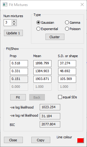
Click the Cluster button to open the Cluster dialog.
Note that the Target cluster count edit box shows 0. This instructs the algorithm to automatically choose the "best" number of mixtures in the data.
Click the Cluster button within this new dialog.
After a brief interval the Cluster dialog shows that the data can best be described by a mixture of 3 normal distributions. It lists the proportion (fraction of the data belonging to that distribution), mean and standard deviation of each sub-class (component) of the mixture.
Click the OK button in the Cluster dialog.
The Fit Mixtures dialog now shows the parameters of the 3 component distributions, and the red histogram line shows these superimposed on the histogram.
Rather surprisingly, the PDF line has just 2 peaks, and looks like it only contains 2 distributions. However, the distributions in the first and third rows in the Fit Mixtures dialog have rather similar mean values which approximately co-locate with the right-hand peak, but that in the third row, which only contains about 15% of the data, has a much broader standard deviation. The right-hand peak in the PDF thus has a broader base than that which would be produced by the standard "bell curve" of the first component normal distribution alone.
Physiologically, the 2 main distributions represent the two extracelluar spike types marked by events in the main view. Each of these will have a characteristic shape, but individual spike shapes will be contaminated by noise, thus producing a spread about the "true" shape. The third, minor distribution, is probably caused by spike collisions producing a more substantial deviation from the characteristic shape than that produced by noise alone.
The goodness-of-fit of the mixture to the data is indicated by the 3 values at the bottom of the Fit Mixtures dialog (-ve log likelihood, -ve log rel likelihood and BIC). The interpretation of these numbers is discussed below.
a
b
Fitting parameters to a bimodal histogram. a. The Event Parameter histogram dialog shows a bimodal distribution of peak-to-peak amplitudes in the parent trace. The PDF of a mixture of 3 Gaussian (normal) distributions is superimposed (red line). Note that the histogram bin colour has been set to pale grey to make the PDF more visible. b. The Fit Mixtures dialog shows the parameters of the PDF. The parameters of the 3 components were determined by using the automatic Cluster method.
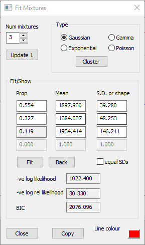
Manual
The automatic method uses the raw data underlying the histogram to find the best mixture parameters, but the manual method uses the counts in the histogram bins to find a PDF that fits the shape of the histogram. The main purpose of the manual method is to fit to non-normal distributions (an example is given later), but it can be used for Gaussian distributions if desired.
In the manual method, the user first has to make a "best guess" of the distribution parameters to get the PDF into approximately the correct shape. The parameters are then fine-tuned to maximize the likelihood of the fit using Powell’s minimization method (Press et a., 2007). However, since we have just applied the automatic method we already have a good fit to the histogram, so we can just skip to the fine-tuning stage.
Click Fit in the Fit Mixtures dialog.
There is a very slight change in the parameter values, but the overall shape of the PDF hardly alters.
As stated above, the manual methods fits the parameters to the histogram shape, so, unlike the automatic method, it is sensitive to the bin width and X axis scales.
In the main histogram dialog, set the Bin number to 10.
Click Fit in the Fit Mixtures dialog.
The parameters of the 2 main components do not change much, but the minor 3rd component has a significantly larger S.D. It is likely that the reduced bin count hides the details of this component, thus making the fit less accurate.
Restore the histogram Bin number to 50.
Three or Two Mixtures?
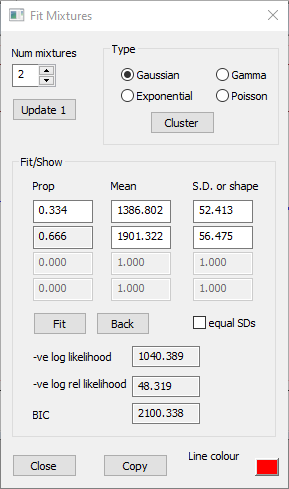
The histogram looks bimodal, and by-eye it is by no means obvious that the right-hand cluster in the histogram is made up from 2 superimposed normal distributions with different standard deviations. Occam's Razor therefore suggests that maybe 2 components provide an adequate fit to the data. We can force the automatic method to find just 2 components as follows:
Repeat the automatic parameter search as above, but in the Cluster dialog, change the Target cluster count from 0 to 2.
Now click Fit, and again note that the parameter values hardly change at all from those found by the automatic method.
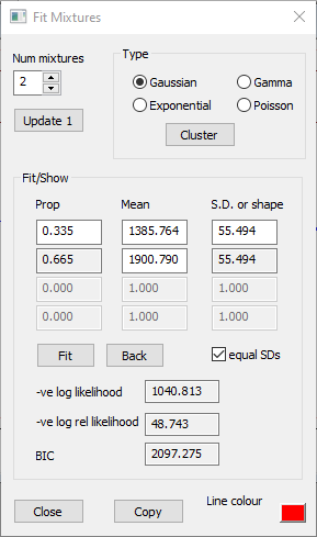
The standard deviations of the two mixture components are very similar, so we can further reduce the complexity of the model by forcing the manual Fit to assume that the standard deviations are identical.
Check the equal SDs box in the Fit Mixtures dialog.
Click the Fit button.
The S.D. value is now the same for each component, and has a value about mid-way between the values of the two S.D.s when they were fitted independently. Whether these simplifications are a good idea is discussed later.
Goodness-of-Fit Measures
Note that the goodness-of-fit measures all apply to how well the PDF mixture fits to the histogram (i.e. the bin counts), not to the underlying data. However, the measures are calculated for both automatic and manual fitting.
The Bayesian (Schwartz) Information Criterion (BICThe BIC is similar in concept and usage to the Akaike Information Criterion (AIC), although the BIC usually penalizes complexity slightly more than the AIC.) is a numerical value that helps choose between models with differing likelihoods and different numbers of parameters. The likelihood of a model can usually be increased by increasing the complexity of the model. Thus in theory one could exactly fit a Gaussian mixture to a histogram by setting the number of components in the mixture equal to the number of bins, and giving each component a low standard deviation and a mean value equal to the mid-bin value. This is known as overfitting! The BIC formula introduces a penalty for increasing complexity which will tend to counterbalance the increased likelihood of the more complex model.
In general, one should choose a model having a lower BIC value in preference to one having a higher BIC value. If the increased likelihood of a more complex model compared to a simpler model is large enough, it will have a lower BIC value despite its increased complexity, and the more complex model should be chosen. However, if the increased likelihood is not sufficient to "justify" the increased complexity, then the BIC value will be higher than the simpler model, and the simpler model should be chosen. The absolute value of BIC has little meaning, and it should not be used to choose between different types of model, but rather between models of the same type but of varying complexity.
The formula for the BIC in a likelihood estimate is:
BIC = -2 ln(L) + k ln(n)
where L is the maximized value of the likelihood of the model, n is the number of data points, and k is the number of parameters.
Comparison of Fit Methods
For convenience, the Fit Mixture dialogs for the 6 fitting procedures described above are shown below.
a
b
c
d
e
f
Fitting a Gaussian mixture model to the same data with various methods. a. Automatic fit, with automatic selection of the number of mixtures resulting in 3 distributions. b. As (a) but followed by manual fit. c. As (b), but with the number of histogram bins reduced to 10. d. Automatic fit, with forced selection of 2 distribution mixtures. e. As (d) but followed by manual fit to 50 histogram bins. f. As (e), but with the standard deviations of the 2 mixtures forced to be equal.
In each case the manual method provides a marginal improvement in the fit measures compared to the automatic method (compare a vs b, and d vs e above). However, this is not surprising, because the manual fit explicitly maximizes the fit between the parameters and the histogram, and the likelihood and BIC measures quantify exactly that fit! This does not mean that the manual method gives a "truer" analysis of the underlying data, since changing the histogram bin count from 50 to 10 produces at least as big a change in manual fit parameter values as the change from the automatic to manual fit method (compare a, b and c above). Note that you cannot compare the goodness-of-fit measures between the 50 and 10 bin histograms (b and c above), because that change applies to the data, not to the parameters, and the goodness-of-fit measures the likelihood of the parameters, given a particular fixed set of data.
The manual goodness-of-fit measures do allow us to compare the 3 and 2 mixture counts, and the equal and unequal S.D. specification, because the data (histogram bin counts) are not changing. The manual 2-mixture fit negative log likelihood values are higher than those of the 3 mixture fit, so the fit is worse, and the BIC value is also higher (compare b and e above). So the substantial reduction in complexity in dropping from 3 to 2 mixtures (which reduces the free parameters from 8 to 5) does not justify the worsening of the fit. However, if we force a fit to 2 mixtures, then also forcing the S.D. values to be equal reduces the BIC value, so this simplification would be justified. This is not too surprising, because the S.D. values are fairly equal anyway. (If we forced equal S.D.s in the 3 mixture model the BIC value would increase, because the minor component of the mixture has a substantially different S.D to the 2 major components. We would also get a quite different mean and proportion for that component, and a worse likelihood fit.)
So, the bottom line for these data is that the 3-component fully automatic fit method probably provides the best description of the data.
Close the Histogram dialog. This will also close the Fit mixtures sub-dialog.
This file is an event-only file, with channel a containing a set of regular pulses (250 ms interval, 200 ms duration). Channel b contains random events with a Poisson distribution with a mean interval of 100 ms, while channel c contains a Poisson distribution with a mean of 20 ms. For both channels the intervals are restricted to the range from 2 to 5000 ms. Channel d contains a mixture; the first half is copied from channel c, the second half from channel b.
Select the Event analyse: Histogram/statistics menu command to activate the Event parameter histogram dialog box.
The default parameter for the histogram is inter-event Interval and the default event channel is a. All the events in channel a have the same 250 ms interval, so they are all in one bin in the histogram.
In the Event parameter histogram dialog box set Event channel 1 to b.
You should see a rather obvious exponential distribution in the histogram.
Check the Show/Fit PDF mix box towards the bottom-left in the Histogram dialog. A second dialog box, the Fit mixtures box, displays beside the histogram dialog.
When the Fit mixtures dialog box is displayed, a red curve showing a scaled PDFPDF = probability distribution function. is superimposed on the histogram. The default is to show the PDF of a single Gaussian (normal) distribution, but this is clearly wrong for these data.
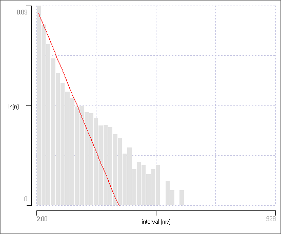
In the Fit mixtures sub-dialog, select Exponential as your choice of Type
An exponential distribution is defined by a single parameter, the mean interval, and as soon as you select the new Type, the PDF curve will update to an exponential distribution with the mean value read from the data. The mean value should be approximately 100 ms, and the PDF should be a good fit to the data.
Select the ln(Y) display option from the drop-down Y axis scaling list in the main Histogram dialog.
The counts now display on a logarithmic scale, and these fall more or less on a straight line, as they should for an exponential distribution.
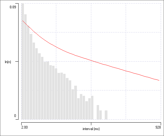
In the main histogram, switch to event channel c.
The bin counts still fall on a straight line, but the PDF line is wildly wrong.
Click the Update 1 button in the Fit Mixtures dialog to update the PDF from the data. Once again there is a good fit.
Mixed Exponentials
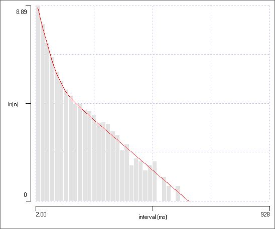
In the main histogram, switch to event channel d.
Click the Update 1 button in the Fit Mixtures dialog to update the PDF from the data. Now the line clearly does not fit the data (figure panel a below).
Event channel d contains a mixture of 2 exponential distributions. There is a clue to this in the histogram - a line through the peaks of the bins has a distinct kink in it at an X axis value of about 100 ms.
We would like to fit a mixed exponential PDF to the data. Dataview does not have an automatic method for fitting mixed non-Gaussian distributions, so we will have to do a manual fit, and that requires making an initial guess at the distribution parameters in the Fit Mixtures dialog.
Increase the Num mixtures to 2.
Set the Proportion in the top row of parameters to 0.5.
The proportion in the second row will automatically adjust to 0.5, to keep the total at 1.
In the main histogram, hover the mouse over the bin peaks about half way to the left of the kink point, and note the X value displayed at the top-right of the histogram dialog. It should be about 70 ms.
Hover the mouse over the bin peaks about half way to the left of the kink point, and note the X value. It should be about 300 ms.
Enter 70 into the Mean edit box in the first row of parameters.
Enter 300 into the Mean edit box in the second row of parameters.
The red PDF line now has a distinct kink in it too. It is still a lousy fit to the data, but it may do as a starting guess (figure panel b below).
The three stages of fitting the mixed exponential PDF are shown below:
a
b
c
Fitting a PDF to histogram containing a mixture of 2 exponential distributions of intervals. Bin counts are in the logarithmic domain. a. The PDF is fitted to a single exponential with the mean interval set to the global mean read from the data. b. A user-specified initial guess at the parameters of a mixture of 2 exponentials (proportions: 0.5, 0.5; means: 70, 300 ms). c. A best-fit 2-component PDF to the histogram display (proportions: 0.839, 0.161; means: 20.159, 101.499 ms).
In the main histogram, return the Y axis scaling to normal (non-logarithmic).
The mixed exponential PDF shows a good fit to the normal data (non-log counts), but it is much harder to see the inflection point. This is why it is easier to make the initial guess at mixture parameters when counts are shown in the log domain.
Poisson Distributions
You may wonder why a series of events which are claimed to come from a Poisson distribution has an exponential distribution. This is because Poisson events do indeed have an exponential interval distribution – the Poisson part refers to the distribution of the number of events that occur in a fixed time period.
Select Distrib count from the histogram drop-down Parameter list.
Set the Distrib bin (distribution bin) to 200 ms.
DataView divides the analysis window into a contiguous sequence of 200 ms distribution bin lengths, and counts how many Target events there are in each length. The histogram shows how many such lengths there are with 0, 1, 2 etc Target events within them. Thus the left-most bin in the histogram shows how many 200 ms lengths have no events within them - there are about 360 such lengths (the bin height is about 360). The next bin shows that there are 683 lengths with 1 event within them, and the next bin shows there are about 665 lengths with 2 events within them. And so on. The histogram X axis is set to autoscale, and it shows that there are no lengths containing more than 10 events (the right-hand X axis scale is 11, but it is the left bin boundary value that specifies the count). Note that the X axis scale will attempt to automatically adjust so that the bin width becomes an integer value. This is because fractional counts of occurrences makes no sense.
Select %age Y from the drop-down Y axis scaling list.
This normalizes bin heights by expressing them as the percentage of the total number of distribution bins in the analysis region.
The histogram shows the typical skewed shape of a Poisson distribution in the histogram.
Select the Poisson option in the Fit mixtures dialog box.
Click Update 1.
The PDF is draw differently for the Poisson distribution because the distribution is discrete rather than continuous, and so it only makes sense to apply the PDF to integer values of the X axis.
In the main histogram dialog, change Target channel to c.
Click Update 1 in the Fit mixtures dialog.
With the higher average frequency the skewed Poisson distribution becomes more like the symmetrical Gaussian distribution.
Switch between Gaussian and Poisson choices in the Fit mixtures sub-dialog and note the relative likelihood values. The Poisson distribution produces a value of about 26, whereas the Gaussian distribution has a likelihood of about 68), indicating that the former is still a better model, despite the fact that the distribution “looks” approximately normal.
Change the histogram Target channel to d, then you have a mixture of Poisson distributions which you can try fitting on.
The Distribution count display measures Target events in the continuous sequence of all the Distribution bin lengths in the analysis window. However, you get the same distribution pattern even if you look at discontinuous lengths.
Select Count 2 in 1 from the histogram drop-down Parameter list.
Set Chan 1 to a.
Set Chan 2 to b.
The histogram now shows the number of events in channel a which encompass 0, 1, 2 etc events in channel b. The shape of the histogram is the same as before, although of course the bin counts are lower because we are not counting channel b events from the entire recording.
Switch Chan 2 to c, and note the more Gaussian shape to the distribution when channel 2 events occur at the higher frequency.
The topic of how Poisson spike distributions can arise from membrane noise is explored in the Poisson from noise tutorial.
This file contains a mixture of events drawn from a gamma distribution with a shape factor 3. This sort of distribution is like a Poisson distribution, except with a built-in “refractory period” that prevents the occurrence of very short intervals. (Gamma distributions often provide a reasonably good way of describing inter-spike intervals for randomly spiking neurons. The Poisson distribution actually is a gamma distribution, with shape factor of 1.) Channel a has high frequency events (mean interval 50 ms), b has lower frequency (mean interval 500 ms), and c and d are a mixture of a and b, with d being just a shuffled version of c.
Select the interval parameter for histogram display.
Set the event channel to d.
Note that with the standard linear X-axis display, the histogram has a very long tail to the right, but with very few counts in the tail. This reflects the low frequency (long interval) part of the mixture, while the condensed large peak to the left reflects the high frequency component.
Check the Log data box in the Histogram dialog.
The histogram now shows the logarithm of the intervals, so that each bin of the histogram contains a successive larger multiple of the interval range as you move to the right. This means that bins to the right of the histogram contain counts over a wider range of intervals than bins to the left, which in part compensates for the fact that the bins to the right represent the lower frequency component and thus have fewer counts. The histogram is now bimodal, and the 2 peaks fall on the 2 mean values of the mixed distribution.
Hover the mouse over the two peaks in turn, and note that the non-logarithmic X values (shown above the histogram to the right in the dialog) are about 40 and 400.
Check the Show/fit PDF mixture box.
In the Fit mixtures dialog, check the Gamma type box and set the Number of mixtures to 2.
Set the following initial values for the 2 mixtures: Proportion 0.5 each, Means 40 and 400 (from the mouse hover), Shape 1.
You should see a bimodal PDF, but it is not a good fit to the data.
Click the Fit button.
With luck, you will now have a much better fit between the PDF and the data, and the parameters will not be far off those used in constructing the data. Note that the 0.9 : 0.1 proportion reflects that the fact that the two distributions occupy equal total time, but one has 10 times as many events as the other.
The take-home message here is that a histogram with the X axis displaying logarithmic data may provide a better visualization of intervals that follow a Poisson or gamma distribution then a histogram with a linear X axis. Since many spike trains seem to follow a gamma-like distribution, this may help the characterization of inter-spike intervals.
The fit method finds a local minimum rather than a global minimum, so if your initial "by-eye" estimates are wildly wrong, the pdf fit is likely to also be wildly wrong. However, this is usually very obvious, so you can just improve your initial estimates and try again.
Statistics and Phase Calculation
The text display above the histogram gives key statistical parameters of the data producing the histogram. For most histogram types the statistics have standard meaning, but for the Phase parameter circular statistics are used (see Zar, 2010 for details). Consider two event channels which are more-or-less in phase with each other. This would generate a histogram with phases tightly clustered around the 0 – 1 value, which would have a highly bimodal appearance. However, the mean value is calculated using circular statistics in which the range 0-to-1 represents points around the circumference, and with 0 and 1 being actually the same point on the circle. The mean phase would thus have a value close to either 0 or 1, rather than close to 0.5 as would be the case of the mean was calculated in the standard way.
Load the file phase.
Note that the display shows progressively more noisy sine waves, with events triggered around the peak of the wave.
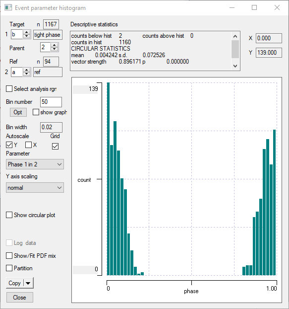
Select Phase 1 in 2 as the histogram display parameter.
Set Chan 2 to a (the reference channel), and Chan 1 to b.
Make sure the Bin number is set at 50.
The histogram should look like this:
A standard phase histogram where the phase is centred around 0/1 appears bimodal, but the phase itself is actually unimodal.
Now check the Show circular plot box. This displays the histogram as a polar (circular, angle or rose) plot. The 0/1 phase is at the top of the plot, and phase angle progresses clockwise around the circle. If you advance Chan 1 to c, you see an increase in the spread of phase angles. Advance Chan 1 to d, and the phase becomes random.
a
b
c
Circular phase plots. a. Tight phase cluster (derived from the histogram shown above). b. Looser cluster. c. Random cluster.
This is an event only file, constructed from DataView facilities. Event channel g contains events with different Gaussian distributions in different regions. It was constructed as follows: Event channel a contains events with a Gaussian distribution with mean interval of 100 ms, s.d. 10, while channel b contains events with a Gaussian distribution with mean interval of 130 ms, s.d. 20. Ifyou examine the Descriptive statistics produced by the Interval histogram, this will confirm these values.
Channel c divides the record into random intervals, and channel d is simply the inverse of c. These have been logically ANDed with channelsa and b to produce e and f. Finally, e and f were combined with logical OR to produce g, which thus is non-stationary; it contains a mixture of Gaussians made up from stationary Gaussians in different regions.
Activate the Event parameter histogram through the Event analyse: Histogram/statistics menu command, if it is not already active.
Set the display parameter to Interval.
Set Chan 1 to g.
De-select the autoscale X and Y options.
Set the minimum and maximum X scales to 0 and 250 respectively, and the maximum Y scale to 100.
You should now see a somewhat skewed histogram reflecting the mixed Gaussian distributions.
Activate the Fit mixtures dialog as described above, and select 2 Gaussians.
Guess the proportions (e.g. 0.5) and enter the means and s.d.s given above. Click Fit to refine your choices.
By default, the histogram will analyse all the events in a channel. However, you can choose to analyse just a sub-region or regions of the file.
Check the Select analysis rgn box to the left of the Histogram dialog near the top of the graph (a similar control, with similar function, exists in the 2-D Scattergraph dialog).
This displays a sub-dialog box with a drop-down list containing four options. Whole file analyses the whole file, as the name suggests. Visible screen analyses just the data visible on screen, again as the name suggests. You can have two windows showing views of different regions of the same file, and as you switch between windows, the histogram changes to reflect the different visible data. User time allows you to set a start and end time for analysis independent of the view. Finally, gate channel species an event channel to act as a “gate” – only data regions within events in that channel get analysed. If there are multiple events, each event acts as if it was an independent file in its own right, and the final histogram is the summed result of analysis of each of these sub-regions. This can be useful if your data are non-stationary (i.e. changes its characteristics over time) and you only want to analyse data with particular characteristics.
Select gate channel in the Analysis region dialog, and switch the gate channel identity between channels c and d. You will see the two “clean” Gaussians which occur in these discontinuous regions of the file. Click Update 1 in the Fit dialog to see the PDFs.
Continuous Time Histograms
The Freq in time bin and Count in timebin options differ from the other histogram parameter choices in that the X axis represents explicit elapsed time within the recording. For these analyses the recording, or a section of the recording, is divided into a sequence of contiguous time bins. The number of events whose start times fall within each bin is calculated, and, for the Freq option, converted into frequency by dividing by the bin width.
For normal displays (in which the Select analysis Rgn option is not selected) the user sets the analysis start time (as the left-hand X axis scale) and the Bin width and Bin number parameters. The analysis end time (right-hand X axis scale) is automatically calculated from these values. If the Select analysis Rgn option is selected, then the active section of the recording (as indicated by the X axis scale values) is determined by the options selected within the Analysis region dialog. The user sets the Bin number in the main histogram dialog, and this automatically adjusts the bin width to provide complete coverage of the active section.
Optimal Bin Width
One of the problems with histograms is choosing an appropriate bin width (or equivalently, bin number) for the display. If the width is too small, the output is dominated by spurious fluctuations due to random variations in the data, if too large, key details may be missed. Knuth (2013) suggested a Bayesian methodology for calculating an optimal bin width given the data themselves.
The intervals are actually generated from random numbers with a mean of 100 and s.d. of 20, but with 50 histogram bins, the display is quite “lumpy”. Of course, with real data we would not know whether the lumps and bumps actually meant something, or whether they were just chance. Optimizing the bin number helps us decide.
Check the show graph box under the Bin number option. This does nothing at the moment, but it will soon.
Click the Opt button.
A graph LogP of bin number displays showing the probability metric (the relative log posterior probability) for bin counts from 1 to 50, and this graph peaks at a value of 16. The main histogram is set to have a Bin number of 16 (previously it was 50), and the X axis scales have been set to encompass the data range (which is a necessary condition for the algorithm). Note that the histogram now just shows the shape of the normal distribution.
Close the graph (it is modal, and you cannot do anything else while it is open - it is only for information and you do not need to actually show it for the algorithm to work.
Set the Bin number to 250, which is fairly obviously a ridiculously high number given the data.
Click Opt again, and observe that the graph takes off in a smooth curve at the right-hand end, giving a spurious maximum.
The take-home message here is that the optimization algorithm works best if the initial Bin number (which sets the maximum number of bins that will be included in the algorithm) is set to a high but plausible value. Inspection of the graph can reveal whether the algorithm is working within the plausible range.
Now set the Bin number back to its default value of 50.
Switch Chan 1 to b.
These events have a step-wise uniform interval distribution (50 at 100-200, 100 at 200-300, 300 at 300-400, 550 at 400-500), and the steps are vaguely visible in the histogram.
Click Opt, and note that there are now just 4 bins, encompassing the steps in the distribution. I think this is a pretty impressive justification of Knuth’s algorithm!
Set the Bin number back to 50.
Switch Chan 1 to c. This contains events with a single uniform distribution.
Click Opt.
The algorithm correctly selects just 1 bin as the optimal display, despite the apparent structure in the 50-bin display, which is again quite impressive.
Channel d contains events with a Poisson distribution, which is the classic interspike interval distribution for non-pacemaker neurons. Optimization suggests that the underlying distribution probability is best captured with a 23 bin histogram. Channel e contains a complex mix of 3 normal distributions superimposed on a wide-range uniform distribution. This is a case where it is best to increase the initial display above the default 50 bins.
Set the Bin number to 100.
Click Opt.
The algorithm suggests that 81 bins is best to capture this distribution. But remember, the algorithm only searches for an optimum up to the value in the Bin number edit box. There may be a better optimum if a higher ceiling is set, but the strange visual appearance of histogram with very large numbers of bins means that this is rarely useful in practice.
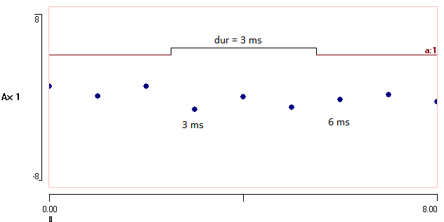
 ).
).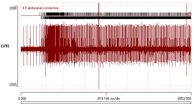


 ).
).