Contents
Correlation analysis
Event auto-correlation
Event cross-correlation
Waveform auto-correlation
Waveform cross-correlation
See also ...
Correlation Analysis
Two different types of correlation analysis can be performed; event correlation, and waveform correlation. Within these categories, auto-correlation looks for time-related patterns of activity within a single event channel or data trace, while cross-correlation looks for a relationship between the activity in two separate event channels or data traces.
Event auto-correlation
- Load the file event auto-corr.
This is a simple event-only file, in which events were inserted into channel a with a Gaussian distribution with a mean interval of 200 ms and a standard deviation of 20 ms, and into channel b with a Poisson distribution with the same mean interval.
- Select the Event analyse: Histogram/statistics command to show the Event parameter histogram dialog.
The dialog opens with the default Interval display parameter selected for event channel a. - Uncheck the Autoscale X box.
- Set the left-hand X axis to 0 and the right-hand to 500 ms.
You can see a uni-modal interval distribution. The descriptive statistics confirm the event insertion parameters.
- Now select AutoCorr from the drop-down parameter list.
The original peak is unchanged, but an additional, slightly smaller peak appears with a modal value of about 400 ms, which is twice the interval.
The auto-correlation histogram shows the number of events within each bin on the condition that there is an event in the same channel at time zero. It differs from the interval histogram in that it considers intervals between all pairs of events whose inter-event interval occurs within the time set by the X axis scales, irrespective of whether other events have intervened.
- Set the right-hand X axis to 2000 ms.
There are now multiple peaks in the histogram, each 200 ms apart. However, the peaks decline in amplitude. This is because the time interval between widely-separated events will be more variable than that between closely-separated events, because each interval adds its own individual variation.
- Check the Draw expected +/- 99% confidence box.
The red line shows the expected correlation if the events were completely random, while the purple lines above and below show the confidence interval. The correlation between closely-separated events (the left-hand end) is highly significant, but the correlation between events separated by 10 or more intervals (the right-hand end) becomes insignificant.
- Change the event channel to b, which contains events with the Poisson distribution.
There is now no significant correlation because the time interval between events follows a random exponential distribution, so there is no regularity in the pattern.
Event cross-correlation
Spike (event) cross-correlation examines the relationship between the firing times of two spike trains, where each spike is marked by an event in a specific channel. It essentially calculates the firing probability of a “target” neuron at fixed time delays relative to a “reference” neuron. Thus if there were an excitatory connection from the reference neuron to the target neuron then one would expect an increased probability of firing in the latter at a time delay corresponding to the synaptic delay. Conversely, if the connection were inhibitory, one would expect a decrease in firing probability.
- Load the file coupled neurons.
This file shows simulated activity in two neurons generated by the programme Neurosim. Both neurons spikeThe neurons implement an integrate-and-fire simulation paradigm, so spikes are simple digital off-on-off events. as a result of random fluctuations in membrane potential, but neuron 1 makes an excitatory synaptic connexion onto neuron 2. The spikes in both neurons have been detected as events using the threshold method.
- Activate the Event analyse: Event-triggered scope view command.
- Set the Dur parameter to 30.
Note the small EPSP in the lower trace, which causes a cluster of spikes in neuron 2 about 6 ms after the spike in neuron 1.
- Close the Scope view. (You could leave it open if you have a large screen, but you don't need it now.)
- Select the Event analyse: Histogram/statistics menu command to open the Event parameter histogram dialog.
By default, the initial display will show the inter-event histogram. - Select the CrossCor 2->1option from the Parameters drop-down list.
The histogram now displays a cross-correlogram between the event target channel, and the base (reference) channel. In essence, it shows how events in the reference channel influence the time of occurrence in the target channel. - Check the Draw expected +/- 99% confidence box.
- Set the left-hand X axis scale to –100, and the right-hand X axis scale to +100.
There is a large spike in the histogram occurring left of centre, i.e. at negative time. This seems to imply that events in channel 1 influence the preceding events in channel 2; time runs backwards! However, since neuron 1 (channel a) makes an EPSP onto neuron 2 (channel b), we need to switch the channels.
- Set channel 1 (target) to b and channel 2 (reference) to a. This means that the histogram will now display the correlation between spikes in the post-synaptic neuron 2 (detected in channel b), using spikes in neuron 1 (detected in channel a) as the base, or reference channel. The text CrossCorr 2->1 of the drop-down parameter list is a reminder that if channel 2 “drives” channel 1, this will result in a positive correlation at positive time.
At this point the histogram should look like this:
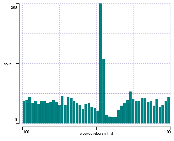
The bright red line shows the expected bin count if there was no interaction between the channels. At the left-hand end of the histogram the bin counts deviate only a little from this value. However, there is a very large peak in the histogram at about +7 ms, which considerably exceeds the 99% confidence interval for the expected bin count. This obviously reflects the fact that neuron 1 puts an EPSP onto neuron 2, which therefore increases the probability of a spike occurring in neuron 2 just after a spike in neuron 1. Furthermore, there is a drop below the confidence limit at about +20 ms. This reflects the diminution in the probability of neuron 2 spiking in its refractory period following the spikes elicited by the EPSP.
Random Resample Intervals
We can check the robustness of a correlation by randomizing the data.
- Select the Event edit: Timing: Random shuffle/resample intervals menu command to open the Shuffle/Resample Event Intervals dialog.
- Select Resample as the randomization choice.
- Chose b as the source channel and c as the destination channel in the subsequent dialog box.
- Click OK to dismiss the dialog.
- Set the Target channel in the histogram to the newly-resampled channel c.
When you dismiss the dialog box, channel b is copied to channel c but the intervals between start times are set by randomly sampling (with replacement) intervals from the original channel b. The first event start time is also reset by a random interval relative to the (new) second event start time. This process means that the interval distribution is statistically similar to the original (a bootstrap process), and an autocorrelation has the same shape although is randomly varying in detail, but the peak in the cross-correlation with channel a has now completely disappeared. The resampling acts as a sort of control to see what sort of correlations turn up by random chance.
You can also shuffle the intervals, which essentially means resampling them without replacement. This means that the new distribution is identical to that of the original, but this is apparently a less statistically robust process than resampling with replacement for assessing correlations produced by chance.
Correlation Index
The cross-correlation histogram is an excellent tool for investigating the detailed timing relationship between spikes in two neurons, but it is a bit cumbersome if you want to quickly examine multiple pairs of neurons, such as can be generated with a multi-electrode array recording. The correlation index (Wong et al., 1993) is widely used as a useful one-number summary of correlation in such circumstances. It is calculated as the ratio between the number of spikes in a specified neuron that occur within a defined time window of each spike in a (different) reference neuron, compared to the number of spikes in the specified neuron that would be expected to occur within those windows if the neuron were firing at its current average rate, but completely independently of the reference neuron.
The value is easy to interpret. A value of 1 means that the level of correlation is no greater than that which would be expected by chance. Values greater than 1 mean that there is more correlation than one would expected by chance, and the actual value is the fractional increase (e.g. an index of 3 means 3 times as many). Values less than 1 indicate anti-correlation; fewer correlated spikes occur than would be expected by chance.
- Make sure that file coupled neurons is still loaded.
- Select the Event analyse: Correlation index menu command to activate the Correlation Index dialog box. The default settings have a correlation window of 10 ms on either side of the reference spike, and the default event channels are a and b.
- The bidirectional correlation indices are visible in the values text window, along with a probability value derived from a simple chi-square test.
The correlation indices between a and b, and b and a, are each approximately 2, and the values are highly significant. Since neuron A tends to drive spikes (through an EPSP) in neuron B, it is not surprising that there are more A spikes within 10 ms either side of B spikes than would be expected by chance, and vice versa.
- Change channel 2 to c (assuming that this contains the randomized sequence from b constructed in the previous tutorial). Note that the correlation indices are now close to 1 and are not significant, indicating the absence of correlation.
The window does not have to be symmetrical about the spike in the reference neuron, although in most studies it is. This means that the index itself can be different depending on which neuron is the reference and which is the specified other.
- Change channel 2 back to b.
- Set the Correlation window: start to 5, keeping the end value at 10.
The algorithm now looks for neuron B spikes in a window between 5 and 10 ms after each neuron A spike. Since neuron A drives neuron B with about this latency, the A-to-B correlation index is high (5.5). However, neuron B does not drive neuron A, so the correlation index in the reverse direction shows no correlation.
Spike Time Tiling Coefficient
The numerical value of the correlation index is dependent on the frequency of reference spikes and the size of the specified window, as observed by Cutts & Eglen (2014). This is implicit from the index definition: if the reference spike rate is very high, and the window is relatively large, the windows around the reference spikes will overlap completely. This means that all the spikes in the specified other neuron will inevitably occur within a reference window, and also all these spikes will be expected to occur within a window. This results in a correlation index of 1 (suggesting no correlation), no matter how tightly the two spike trains are synchronized. For this reason, correlation indices near 1 should only be taken as an indication of no correlation if the total window duration is only a small fraction of the total duration (i.e. there is plenty of opportunity for the other spikes to occur outside of the reference windows).
This also means that you cannot make quantitative comparisons between correlation indices if there are differences in the underlying spike rates. A low-frequency pair of spike trains showing complete synchrony will have a higher correlation index than a higher-frequency pair of spike trains which also show complete synchrony, even though the degree of correlation (which is complete synchrony) is arguably the same for both. This is because for a fixed window size, there is more opportunity for random spikes to occur outside windows with a low frequency of occurrence, then there is when the same window size has a high frequency of occurrence.
To overcome the limitations of the correlation index, Cutts & Eglen proposed a different metric which they called the spike time tiling coefficient (STTC). They define the STTC as follows:
\begin{equation} STTC=\frac{1}{2}\left(\frac{P_A-T_B}{1-P_AT_B}+\frac{P_B-T_A}{1-P_BT_A}\right) \end{equation}where TA is the proportion of total recording time that lies within the defined window (±Δt) around any spike in neuron A and TB is defined similarly. PA is the proportion of spikes in neuron A which lie within the window (±Δt) around any spike in neuron B and PB is defined similarly.
The STTC varies between +1 indicating perfect synchrony (within the granularity defined by the window size), 0 indicating no more synchrony than would arise by chance, and -1 indicating anti-correlation (although the latter value cannot actually be attained with this algorithm). It does not vary with spike frequency, and by design it is symmetrical between spike-train pairs, so a single value is given for each pair.
- Switch between calculating the correlation Index and the STTC by clicking the appropriate radio button.
Waveform auto-correlation
Waveform auto-correlation plots (normalized autocovariance) are used to test for randomness in time series data. They can detect subtle underlying rhythms and sequential correlations.
An auto-correlation coefficient is calculated for a particular lag by multiplying each sample in the signal by the equivalent sample in the same signal shifted by the lag. The results of these multiplications are added together and then normalized. The effect of normalization is to restrict autocorrelation coefficients to values between +1 (perfect correlation) through 0 (no correlation) to -1 (perfect anti-correlation).
A strong positive coefficient at lag h means that if the signal has a certain value at time t, on average it is likely to have a similar value (same sign, similar amplitude) at time t+h, and this applies to all times t. A negative coefficient means that the value at time t+h it is likely to have the opposite sign to its value at time t. So a property such as membrane potential will inevitably show strong positive autocorrelation at short lags, since the membrane capacitance means that the voltage cannot change very rapidly, and its value at time t is not going to be very different from its value at time t+h, if h is small. [Note that the resting potential offset itself imposes auto-correlation, but this is discounted in the default algorithm. See Autocovariance and DSP below.]
The overall formula for calculating an autocorrelation coefficient is:
\begin{equation} R(h) = \frac{\sum_{t=1}^{n-h}(Y_t-\bar{Y}) (Y_{t+h}-\bar{Y})} {\sum_{t=1}^{n}(Y_t-\bar{Y}) ^2} \end{equation}
where R(h) is the auto-correlation coefficient at lag h, Y is the data value at time t or t+h, $\small{\bar{Y}}$ is the mean value of Y and n is the sample count.
It is normal to calculate autocorrelation coefficients over a series of lags from 1 sample to a value which encompasses the timescale of the suspected underlying correlation, and then to plot these coefficients against the lag. The coefficient at lag 0 will always be 1, since a signal obviously correlates perfectly with itself at any given moment in time.
NOTE: waveform correlation analysis is quite processor intensive and can take a long time with large files, so the default settings for both the auto- and cross-correlation analysis only analyse relatively short sections of waveform, with short maximum lags. This is to prevent the user starting a very lengthy analysis by mistake.
-
Load the file wave correlation.
- Select the Analyse: Autocorrelation menu command to activate the Trace autocorrelation dialog box.
You will see a plot of the autocorrelation coefficients of trace 1 for lags 1 to 10. The coefficient value at lag 0 is always 1 (any sample point correlates perfectly with itself), so this is not displayed.
We would like to analyse more data, so:
- Select the Analysis window: whole file option.
- Set the Maximum lag to 100 ms.
Trace 1 contains a sine wave with a period of 60 ms (it’s in the formula used to construct the trace) so a lag of 100 ms will capture that signal. However, in a real experiment the optimal maximum lag value has to be estimated from your knowledge of the data. The longer the lag and the more data included in the analysis, the greater the chance of observing low-frequency oscillations with a poor signal-to-noise ratio, but the slower the analysis.
The autocorrelation analysis now shows an obvious pattern in the coefficient plot. At the minimum lag of 1 sample (at the left end of the plot) the values are close to the maximum possible value of 1. This is because at all parts of the raw data trace the value at one point in time is only slightly different from the value immediately following it (where the lag is just 1 sample) – i.e. there is very high serial correlation in the data. The coefficients then drop to a negative value close to the minimum possible of -1. This is because the data contain a sine wave, and half a cycle after each point the data value will be symmetrically opposite to the value at that point. The coefficients then climb back to a high value, because one full cycle after each point the value is the same as at the point.
- For comparison, advance the Data trace to 2.
Trace 2 contains noise in which each data point is drawn randomly from a standard normal distribution. There is thus no serial correlation and the correlation trace is essentially a zero-valued flat line.
Confidence Intervals
By default, upper and lower confidence limits at p = 0.01 are drawn as two blue lines on the correlation graph.
The confidence interval for deviations from a coefficient of zero is calculated thus:
\begin{equation} \pm\frac{z_{1-\alpha/2}}{\sqrt{n}} \label{eq:eqCorrConfLim} \end{equation}where where n is the sample size, z is the cumulative distribution function of the standard normal distribution and α is the significance level (from the Engineering Statistics Handbook).
The probability that the observed autocorrelation could arise by chance is given by the Ljung-Box test (Q statistic). The formula is
\begin{equation} Q=n(n+2)\sum_{j=1}^h \frac{R_j^2}{n-j} \label{eq:eqLBTest}\end{equation}where n is the sample size, h is the maximum number of lags, Rj is the correlation coefficient at lag j. Q follows a chi-squared distribution with h degrees of freedom. If Q is significant it suggests that enough correlation coefficients differ sufficiently from 0 to suggest that the data are not random.
For trace 2 the test p value (prob) is 0.66, correctly indicating that in the random trace the deviations of the autocorrelation coefficient from 0 could easily have arisen by chance.
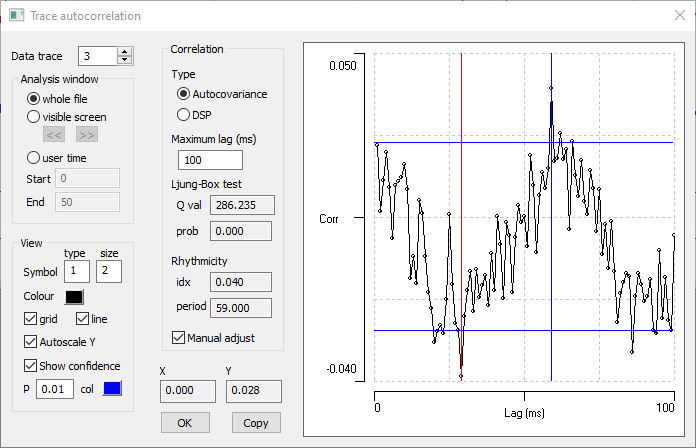
- Set the Data trace to 3.
We know that trace 3 contains a sine wave in there because it was in the formula that generated the trace. However, its amplitude is quite small compared to the noise (only 0.2 of the standard deviation), and its existence is not very obvious in the coefficient display (nor in the actual data trace in the main window). , Nonetheless, the test p value is highly significant.
- Check the Autoscale Y box on the left of the dialog.
At the higher magnification, the rhythmicity in the coefficient display becomes clear.
- Uncheck the Autoscale Y box
- Set the Data trace to 4.
Trace 4 contains noise, but the noise follows an Ornstein-UhlenbeckThe OU distribution is based on a random walk, in which the next value is a random deviation from the previous value. However, it is modified so that there is a tendancy for the walk to move towards a central location, and the further a value is from that centre, the stronger is the attraction back to the centre. (OU) distribution which imposes serial correlation. It does not contain any sine wave.
The correlation coefficients start close to 1, but then decline towards 0. At a lag of 1 time constant (25 ms, defined in the formula that produced the trace) the correlation coefficient has a value of about 0.32, which is what we would expect after 1 time constant in a declining exponential curve. This is exactly the distribution that the OU process produces.
There is no inherent rhythmicity in trace 4.
Rhythmicity
Autocorrelation tests are often used to detect rhythmicity in a waveform, and DataView provides some simple tools to aid the analysis.
- Set the Data trace back to 1.
This is obviously highly rhythmic, being a pure sine wave. DataView marks the first trough in the correlation coefficients with a red line in the coefficient graph, and marks the first peak following that trough with a blue line. The time lag to the blue line (the first peak after the first trough) gives the cycle period of any rhythm in the data. The period is correctly identified as 60 ms in the Rhythmicity section of the Correlation group in the dialog.
The normalized difference in the coefficient values at the first trough and first following peak give a rhythmicity index, which varies between 0 and 1. The higher this value, the more pronounced the rhythm is in the data. For the pure sine wave in trace 1, the rhythmicity index idx is 0.995 which is very close to 1 (to get an actual value of 1 we would need to analyse an infinitely long set of data).
- Set the Data trace to 3.
- Check the Autoscale Y box.
The first trough and following peak are again marked, but because of the noise the default automatic detection finds a local trough and peak, rather than the correct global locations - automatic detection fails.
- Check the Manual adjust box at the bottom of the Correlation frame.
- Drag the blue cursor to the largest peak in the coefficients which occurs at a lag of 59 ms, and the red cursor to the preceding lowest trough at 29 ms.
The blue cursor location determines the period value displayed in the dialog.
The true period of the sine wave is actually 60 ms (apparent in the constructing formula), so the display of the autocorrelation coefficients does a good job of correctly identifying the rhythm period, given the level of noise. The rhythmicity index still has a low value, because the amplitude of the rhythm is low compared to the noise in the data.
Waveform auto-correlation with manual rhythm selection. - Set the Analysis window to visible screen.
Now a much shorter section of data is analysed, and the rhythm is no longer visible in the coefficient display. Furthermore the Ljung-Box test probability is well below significance. This emphasises the importance of including sufficient data in the analysis. The more obscure the content, the more data are needed to extract its features.
- Reset the Analysis window to the whole file.
- Uncheck the Manual adjust box to remove the cursors.
- Uncheck the Autoscale Y box.
- Set the Data trace to 4.
The data in trace 4 show strong serial correlation, but are not rhythmic. A trough and following peak are still detected (the random fluctuations in the data make their existence almost inevitable), but the rhythmicity index is very low (idx = 0.011), and the trough does not drop below 0, so there is no anti-correlation.
Autocovariance and DSP
DataView provides two ways of calculating the waveform auto-correlation; the statistical method (technically the normalized autocovariance), and the method usually used in digital signal processing (DSP). The main difference between them is that the former removes the mean of the signal from the correlation, while the latter does not. Thus a small but clear sine-wave superimposed on a large DC component would have clear positive and negative correlation with the autocovariance method, but would appear as a small ripple on a dominant positive correlation with the DSP method.
- Click OK to close the Trace Auto-Correlation dialog.
Waveform cross-correlation
Cross-correlation analysis is used to determine the degree of association between two waveforms. Either waveform could influence the other, in either a positive or negative direction, or both may be influenced by some external time-dependent factor, again in either a positive or negative direction. Cross-correlation coefficients at various lags are calculated like auto-correlation coefficients, except that instead of multiplying each sample in the signal by the equivalent sample in the same signal shifted by the lag, it is multiplied by the equivalent sample in the other signal shifted by the lag. As with auto-correlation, cross-correlation coefficients are calculated for lags which encompass the timescale of the suspected underlying correlation, but for exploratory analysis it is usual to show coefficients for both positive and negative lags, since an association can be time-delayed in either direction. The adjusted formula is:
\begin{equation} R_{x,y}(h) = \frac{\sum_{t=1}^{n- \lvert h\rvert}(Y_{h\lt1 ? t:t+\lvert h\rvert} - \bar{Y})(X_{h\lt1 ? t+h:\lvert h\rvert} - \bar{X})} {\sqrt{\sum_{i=1}^n(Y_i-\bar{Y})^2 \sum_{i=1}^n(X_i-\bar{X})^2}} \end{equation}where Rx,y(h) is the cross-correlation coefficient between time series x and y at lag h, X, Y are the data value at time t or t+/-h, $\small{\bar{X}}$,$\small{\bar{Y}}$ is the mean value of x, y and n is the sample count.
- Load the file wave correlation (if it is not already loaded from the previous tutorial).
- Select the Analyse: Cross-correlation menu command to activate the Trace cross-correlation dialog box.
- Select the Analysis window: whole file option.
- Set the Maximum lag to 100 ms.
Initially, both traces are set to trace 1, so this is in fact an auto-correlation analysis, but it shows correlations for both negative and positive lags and includes lag 0.
- Set Trace 2 to 3.
Trace 3 contains the same sine wave as trace 1, but it is embedded in random noise. Note that the noise has no serial correlation within itself (the reason this is important will be explained shortly). The association between the two traces is apparent in the highly significant cross-correlation coefficents, but the peak values of the coefficients are much less than +/- 1 because the noise in trace 3 makes the value of the signal in trace 1 a less accurate predictor of the value in trace 3 than it would be without noise (in the latter case it would be a perfect predictor since the sine waves are identical).
Confounding Serial Correlation
- Set Trace 2 to 4.
The data in trace 4 show strong serial correlation (auto-correlation), but have absolutely no association with the sine wave in trace 1. It is therefore at first sight surprising that the cross-correlation cofficients show clear rhythmicity at the sine wave frequency. This reflects a well-known "gotcha" in cross-correlation analysis: if both data sources in the analysis show serial correlation, then the cross-correlation can appear to be significantly non-zero even if there is no real association between the data. This is because when data show serial correlation, an elevated data value in either source is likely to be followed by a run of further elevated values in that source, and the probability of such runs overlapping by chance in the two data sources is non-trivial.
The problem is that the standard equation for confidence limits \eqref{eq:eqCorrConfLim} assumes that the data values are independent and identically distributed (i.i.d.), and with serial correlation the values are not independent of each other. This is OK for auto-correlation analysis because it is precisely such deviation from i.i.d. that is being looked for, but it is a confounding factor in cross-correlation analysis.
There are two solutions. The first is to "prewhiten" the data. This means applying a filter to remove the serial correlation, and thus to remove the spurious cross-correlation. The problem is that designing an appropriate filter may be quite complicated. The second solution is to leave the spurious cross-correlation alone, but to multiply the standard confidence limits from \eqref{eq:eqCorrConfLim} by a factor F which adjusts them appropriately. If the lag 1 auto-correlation coefficents of the two sources are a and b, then
\begin{equation} F = \sqrt{(1+ab) /(1-ab)} \end{equation}yields an approprate factor (Dean & Dunsmuir, 2016). If either a or b is zero (i.e. one source has no auto-correlation), then this equation yields F = 1 and there is no correction, but if both sources show auto-correlation then F > 1 and the confidence limits are enlarged. This means that the cross-correlation coefficients must be larger in order to be regarded as significant.
DataView applies the correction factor by default, but it can be removed if desired.
- Uncheck the Auto correct box in the dialog and note that the confidence limits shrink.
- Change p to 0.05.
- Check the Autoscale Y box to zoom in the Y scales.
The uncorrected cross-correlation coefficients did not quite cross the confidence limits at p = 0.01, but they do at p = 0.05, thus suggesting that there is statistically significant correlation between the data sources, whereas in fact there is not.
It is counter-intuitive to think that such an obviously non-random pattern of cross-correlation coefficients could have arisen by chance, but that is in fact the case. One data source consists of a pure sign wave which inherently has strong serial correlation, while the other consists of a random walk with strong serial correlation, and the sine wave "bleeds over" into the cross-correlation coefficients, even though there is no actual association between the two data sources.
Common PSPs
It may be useful to look at cross-correlation analysis with more realistic data.
- Load the file common PSPs.
- Select the View: Event-triggered scope view command (also available from the Event analyse and Windows menus) to display the Event-Triggered Scope View dialog .
- Set the Sweep duration to 20 ms.
- Check the Avg button in the Average group.
The data are simulated using Neurosim, so we know exactly what the situation is. Trace 1 (the top trace in the Chart and Scope views) shows a neuron that produces occasional spikes in response to random fluctuations in its membrane potential. The spikes are marked by events in channel a, which is the default trigger channel for the Scope view. The spiking neuron makes excitatory input to two other neurons (traces 2 and 3), with synaptic delays of 1 and 3 ms respectively. Trace 4 shows a neuron that receives similar synaptic input, but from another (unidentified) souce.
- Select the Analyse: Cross-correlation menu command to activate the Trace cross-correlation dialog box.
- Select the Analysis window: whole file option.
- Set the Maximum lag to 20 ms.
- Set Trace 1 to 2 and Trace 2 to 3, to look at the cross-correlation between the two neurons post-synaptic to that in the top trace.
There is highly significant cross-correlation between the membrane potential of the two post-synaptic neurons that peaks at a lag of about 2 ms. This fits with the fact that the synaptic delay to one neuron (trace 3 in the chart view) is 2 ms longer than that to the other neuron.
- Set Trace 2 to 4.
There is no significant correlation between the membrane potentials in these neurons.
See also ...