Contents
Histogram: External Data
Data source
Optimal bin width
Rug plot
Fit mixtures
Kernel density estimate
Circular plot
Histogram: External Data
You can use histogram facilities such as fitting mixtures of different distributions, calculating kernel density estimates (KDEs) etc. with data from sources external to DataView.
- Select the Analyse: External data: Histogram menu command to open the histogram dialog. Unlike most analysis routines, this is available even if no data file is loaded.
Note: to appear in a DataView histogram, data values must be equal to or greater than the lower bound (left-hand X axis scale) and less than the upper bound (right-hand X axis scale).
Data source
The external data source should be a plain-text list of numbers, with one number per line. There are 3 ways to load such data into the histogram:
- Copy the numbers onto the clipboard outside of DataView, and then click the Paste button in the Histogram dialog.
- Click the Load button in the dialog and select a text file (.txt) containing the data.
- Drag-and-drop a text file containing the data from File Explorer onto the Histogram dialog.
Do not open it yet, but be aware that the file mixed gauss.txt (linked below) contains 1000 random numbers. The first 500 are drawn from a normal distribution with mean 0, the second 500 from a normal distribution with mean 3. In both cases the standard deviation is 1.
If you click the link, most browsers will open the file and display the numbers. You can then select them (usually control-a) and copy them to the clipboard (control-c). Then click the browser Back button to return to this page.
- Click the link mixed gauss.txt and follow the procedure above.
- Click Paste in the histogram dialog.
Alternatively, you can
- Right-click the link and select Save link as... from the browser context menu. Save the file to a suitable location, then:
- Either:
- Drag the file from the save location and drop it onto the histogram dialog.
- Or
- Click the dialog Load button and load the file explicitly.
After the histogram data loads, simple descriptive statistics from the raw data are shown in a box above the histogram display. However, these are only meaningful if the data follow a single normal distribution, which these do not. Mixture analysis is described below.
Optimal bin width
The purpose of a histogram is to give an easily-understood visual representation of the distribution of numerical data. However, one problem is that the visual appearance is very dependent on the axis scales and bin number, and it can be quite misleading if these are inappropriate.
DataView implements a Bayesian algorithm for calculating the optimal bin number.
- Click the Opt button to optimize the bin number.
The histogram should now have 15 (rather than the default 50) bins. Further details are given here.
Rug plot
- Check the Rug plot box near the bottom-left of the dialog.
A series of red marks appear under the histogram. Each mark represents an actual value from the data generating the histogram, and each mark is positioned on the X-axis at the appropriate place for its value. This is a rug plot, which is analogous to a histogram with zero-width bins, or a 1-dimensional scatter plot.
Fit mixtures
DataView allows the histogram to be analysed as a mixture of normal (or other) distributions, and since the distribution appears bi-modal (and in fact we know the underlying data are bi-modal) this is appropriate here.
Full details of the fit methodology are given elsewhere, so only an executive summary is given here.
- Check the Show/Fit PDF mix box to open the Fit Mixtures dialog.
A red line appears in the histogram display. This is a scaled PDFPDF = probability density function. drawn from the unimodal descriptive stastics, and it is clearly not a good fit to the histogram.
- Click the Cluster button (towards the bottom-right of the Fit mixtures dialog) to open the Cluster dialog.
- Click Cluster in the new Cluster dialog.
After a brief pause, details of two sub-classes should appear in the dialog. - Click OK in the Cluster dialog.
The histogram display now shows a bi-modal PDF, and the Fit Mixtures dialog shows that these occur in about equal proportion, with mean values of about 0 and 3, and standard deviations of about 1. In other words, the automatic cluster method has correctly identified the parameters of the two component distributions that were used to generate the original numbers.
The Cluster method attempts to automatically discover clusters in the original data, and it uses these to construct the mixed PDF. You can also fit the PDF directly to the histogram bin counts, but this method is not automatic - it requires an initial estimate of the number of mixtures and their parameters. However, we already have this from the Cluster process.
- Click the Fit button in the Fit Mixtures dialog.
There is a slight change in parameter values, but essentially the values of the original data distribution are again fully recovered.
If you want to just see the PDF, without seeing the histogram at all:
- Uncheck the Show histogram box.
The same applies to the KDE display (see below).
- Close the Fit Mixtures dialog (either uncheck the box in the main histogram dialog, or click Close in the Fit Mixtures dialog).
Kernel density estimation (KDE)
Kernel density estimation (KDEThe KDE is also sometimes called the Parzen–Rosenblatt window method, after the statisticians who invented it.) in DataView is a way of smoothing histograms without making assumptions about the underlying distribution of the data. It uses the raw data underlying the histogram, rather than the binned data, and so it is not affected by varying the bin number or width in the histogram, which can have a major effect on the appearance of the histogram. KDE works best with data that do not have "hard edges" - i.e. where the histogram bin counts decline graduallyAlthough, of course, the visual appearance depends on the choice of bin number, which is what we are trying to by-pass with the KDE in the first place. towards zero at either end.
To produce a KDE, each point in the raw data is replaced by a non-negative symmetrical shape that is centred on the point itself. The shape is the "kernel", and typically it is a Gaussian curve, although other shapes can be used if desired. The shape has a specified width called the bandwidth. The values of all these shapes are then summed together and scaled, with the resulting curve \(\hat{f}_h(x)\) being the KDE at value x. Thus:
$$\hat{f}_h(x) = \frac{1}{nh} \sum_{i=1}^{n} K(\frac{x-x_i}{h})$$
where K is the kernel and h is the smoothing parameter (bandwidth).
To see the process producing a KDE we can use the simple list of 3 numbers below:
-4
2
5
- In your browser, drag over just the top number above (-4) to select it, and press control-c to place it on the clipboard.
- In the Histogram: External data dialogIf you have jumped into this web page from elsewhere, the dialog is available on the Analyse menu., click the Paste button.
- Uncheck the Autoscale X and Y boxes.
- Set the left and right X axis scales to -10 and +10 respectively.
- Set the Bin number to 20, which generates a (read-only) Bin width of 1.
- Set the top Y axis scale to 2.
- Check the Rug plot box if it is not already checked. This is not necessary for the KDE, but it helps clarify the data.
A single bar of height 1 should appear in the histogram spanning -4 : -3 on the X axis. The rug plot shows that the datum is actually located at -4.
- Check the Kernel density estimation box.
- You are warned that the data have a standard deviation of 0, but just click OK to dismiss the warning.
The Kernel Density Estimation dialog appears showing the parameters for the estimate. Note that a Gaussian kernel is selected, and the User specified Bandwidth is 1.
A blue line appears superimposed on the histogram. This is the KDE. It is a simple Gaussian (normal) curve centred on the datum value of -4, and with a standard deviation of 1. The area under the curve is the same as the area of the histogram box (i.e. 1).
- Change the Bandwidth to 2, and note that the curve is more spread out, but has a lower peak. Its area is still 1.
- Select the Box kernel option, and note that the normal curve is replaced by a box(!).
- Select the Epanechnikov kernel, and note that the curve is now parabolic.
- Return to the Gaussian kernel with Bandwidth 1.
- Drag over the top two numbers (-4, 2) in the vertical list above (not here), and press control-c.
- Click the Paste button.
The histogram now has 2 bars, and a normal curve has been centred on each. The blue line shows the sum of these curves, but they are sufficiently far apart that each has declined to 0 before it meets the other and so they do not interact.
- Drag over all 3 numbers (-4, 2 and 5) in the vertical list above (not here), and press control-c.
- Click the Paste button.
The histogram now has 3 bars. A normal curve has been centred on each, but the 2 right-hand curves are fairly close together and their tails overlap. The KDE thus does not decline to 0 between these curves.
Wikipedia has an extensive article on KDE, with a worked example that is reproducedI wanted to make sure my code produced the same output as Wikipedia! below.
- Click the link wikipedia eg.txt and copy the 6 data values onto the clipboard as descibed above.
- Click Paste in the histogram dialog.
- Uncheck the Autoscale X box, and set the X axis scales to -4 and 8, and the Bin number to 6.
- Select Density from the Y axis scaling drop-down list.
- Uncheck the Autoscale Y box and set the Y axis top scale to 0.18 (just to give some headroom to the histogram).
- In the KDE dialog, make sure that the Kernel is Gaussian, and that the Bandwidth is set to User.
- Set the Bandwidth to 1.5 (note that this reflects the standard deviation - Wikipedia quotes the variance as 2.25, which is 1.52).
At this point the DataView histogram should look like the Wikipedia example. For comparison, they are shown below.
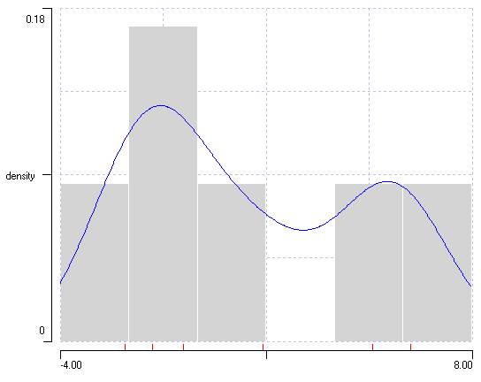
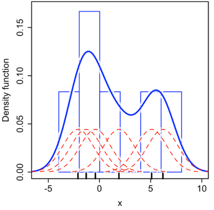
Kernel density estimation in a histogram. a. A histogram generated in DataView from numerical values on Wikipedia. Note that the histogram bins have been set to a pale colour to make the KDE more obvious. b. An edited version of images from Wikipedia, with the KDE superimposed on the histogram. The kernels generated by the individual data values are shown in red, their sum is shown in blue.
- Note: if you just want to see the KDE curve and do not want it superimposed on a histogram, uncheck the Show histogram box.
Bandwidth Choice
One problem with generating a KDE is deciding on the best bandwidth, which can have a crucial effect on the shape of the KDE and hence the interpretation of the data.
- With the histogram showing the KDE as above (with User selected for the Bandwidth choice) set the Bandwidth value to 0.3 and observe the KDE change.
- Now set the Bandwidth value to 3 and observe the change.
If the bandwidth is too small (0.3) it leads to under smoothing, and every lump and bump in the histogram is reflected in the KDEIn the extreme, the KDE would become a simple rug plot.. If it is too large (3) it leads to over smoothing, and every KDE looks uni-modal. Unfortunately there is no easily-generalizable method for deciding on the optimum bandwidth, although there is an extensive literature on the subject. One thing that is generally agreed is that having more data generates more reliable bandwidth estimates, and most automated methods work better with data that has an approximately Gaussian distribution, althought possibly mixed.
- Close the KDE dialog ((either uncheck the box in the main histogram dialog, or click Close in the KDE dialog).
- Reload data from the file mixed gauss.txt as described previously.
- Check the Kernel density estimation box to re-open the KDE dialog (closing and re-opening was simply to get back to the default starting conditions).
You can enter a bandwidth specifically if the User option is selected (as previously). This allows "by-eye" adjustment of the KDE fit to the histogram. DataView also implements some automatic methods for estimating bandwidth. These have the advantage of being objective, but can produce clearly wrong values with weird data.
The Default: Standard method (Scott's rule of thumb) usually works well with unimodal normal distributions:
$$h =\left (\frac{4\hat{\sigma}^5}{3n}\right)^{\frac{1}{5}} \approx 1.07\hat{\sigma}n^{-1/5}$$
The Default: Silverman's (rule of thumb) method produces somewhat narrow bandwidths, and is better for multi-modal or non-normal data:
$$h = 0.9 \min\left(\hat{\sigma},\frac{IQR}{1.34}\right)n^{-\frac{1}{5}}$$
where IQR is the inter-quartile range. (Both of these formulae come from the Wikipedia page, although they are widely available from other sources too.)
Optimal (fast) and Optimal (safe) both attempt to optimize the bandwidth in terms of the AMISE (asymptotic mean square error). The fast method is faster than the safe method, but the latter is less likely to fail to converge. The algorithms for these are a direct translation of the Perl code released by P.K. Janert. Both produce much narrower bandwidth values than the default methods, which means that they follow histogram peaks more closely, but they can under-smooth data which follow a genuine normal distribution. They can only be calculated if the Gaussian kernel type is selected.
Circular plot
Some measurements occur within a contrained range and are "circular" in nature, where a value at one end of the range represents something that is very close to a value at the other end of the range. Thus a time just before midnight is only a few minutes away from a time just after midnight, but expressed as decimal 24-hour clock values, 23.9 and 0.1 would contribute to bins at the opposite end of the scale in a normal histogram .
The solution to such a misleading display is to present the data in a circular histogram plot (a rose plot), and to use specialized circular statistics (Zar, 2010) to describe them.
- Click the link compass 0-360.txt and copy the data values onto the clipboard as descibed above.
- In the Histogram: External data dialogIf you have jumped into this web page from elsewhere, the dialog is available on the Analyse menu., click the Paste button.
The data nominally represent navigational bearings measured as angular degrees. The normal histogram makes it look as if there are two separate bearings, and the Descriptive statistics suggest that the mean value is 168°. However, this ignores the fact that the data wrap-around at the values 0 and 360, which actually represent the same direction.
- IMPORTANT: for circular data, the first thing to do is uncheck the Autoscale X box and set the scales to the wrap-around values.
- So in this case set the left X axis scale to 0 and the right scale to 360.
- Check the Show circular plot box.
A new Circular Plot dialog displays, showing the data are clustered in a northerly direction, and span across the 0/360° wrap-around bearing. The descriptive statistics indicate the mean angle, the dispersion about the mean, the strength of the directionality and the probability that this pattern could have arisen by chance if the values followed a uniform random distribution.
To get a feel for how to interpret the plot and statistics:
- Set the X axis scales to 0 and 4.
- Select various combinations of the numbers below and copy them to the clipboard, then Paste them into the histogram with the circular plot displayed.
0
1
2
3
3
3
For instance, if you just copy the 3s, the mean is 3 and the standard deviation 0 (not surprising) and the vector strength is 1. The probability is highly significant. If you copy and paste all the numbers, the mean is still 3 (it would be 2 in non-circular data), the standard deviation is 0.735, the vector strength is 0.33+, and the probability is not significant.