Contents
Scope view
Match events and display
Gain and position
Count
Highlight sweep
Clipboard
Selecting sweeps
Navigation
Sweep colour
Raster display
3D
Density (heat) plot
Phase plane
Event-triggered averaging
Trace correlation
Measuring data
High-definition output
See also...
Event-triggered Scope view
The event-triggered scope view, henceforth referred to simply as the Scope view, shows sections of data whose viewport is determined by specific events.
- Load file r3s events.
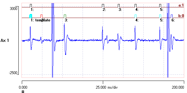
The file contains an extracellular recording from the superficial 3rd root of an abdominal ganglion of a crayfish. A series of events which mark the timing of some medium-sized spikes have been inserted in event channel a. The events were defined using the template recognition facility, which is described in detail here. Event channel b also contains events marking spikes, but they are not all the same as those of channel a, and they have been colour-coded using the Dataview spike sorting facility, also described elsewhere.
The events can be used as trigger points to display data in an oscilloscope-like view. Each event acts as a sweep trigger, and the section of data following each event (optionally including a pre-trigger section) is displayed as if it were a sweep on an oscilloscope.
- Select the View: Event-triggered scope view command (also available from the Event analyse and Windows menus) to display the Event-Triggered Scope View dialog .
The Scope view can be re-sized by dragging on a corner.
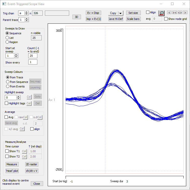
The Scope view is quite complicated with many features, and we will only cover the most important here. The most important feature of all is the graphical display. This shows a series of overlapping sweeps which are the waveforms of data occurring in a time window relative to the start-times of the events in the default event channel a. There are obviously 2 types of spikes showing.
Start time: The sweeps start at a time relative to the on-time of events set by the value of the left-hand X-axis scale Start (re trig), which by default is –1. This means that each waveform is displayed starting 1 ms before the on-time of its associated event.
The 0-time (trigger point, i.e. the on-time of the event) is indicated by a dashed vertical line, if it lies within the screen display.
Duration: The sweep duration is set by the mid X-axis scale Sweep dur.
There are 4 navigation buttons at the top-right of the dialog which can rapidly adjust these parameters if you don’t like typing!
The Scope view is non-modal, which means that you can switch to other windows within the program without having to Close it. If you switch to another file, the display changes to show data from that file.
Match Events and Display
The Scope display starts at a specified time relative to the on-time of the trigger events, but it pays no attention to the duration of the events themselves. Sometimes it is useful to have the display duration match the duration of the events, or vice versa.
Display = Events
- Click the Disp = Ev(1) button near the top centre of the Scope view.
The Scope view display now matches the data encompassed by the first event in the trigger channel. The Start time is set to 0, and the Sweep duration is 2.05 ms, which is the duration of the first event.
The Scope view can only have a single duration and the first event is always taken as the template for the sweep duration. In this file all the events have the same duration so the identity of the template event is irrelevant, but that may not always be the case.
Events = Display
It can be very useful to set events to match what is visible in the Scope view, because these events can then be used in other analysis facilities such as the scatter graph, histogram or parameter list to analyse the waveforms that they encompass e.g. to find the maximum and minimum values. If the events do not match the display (as was the case initially), then part of the data waveform would be excluded from such analysis.
- Return the Scope view display to its original settings by changing the Start time to -1 and the Sweep duration to 3.
- Click the Ev = Disp button near the top centre of the Scope view.
- Dismiss the warning dialog by clicking OK.
The events in channel 1 now all have their start time set 1ms earlier, and their duration set to 3 ms. If you click the Disp = Ev button there is no change in the display, because the events now match the display anyway.
Sweep gain and position
To change the gain or position of a trace within the Scope view, simply use the standard techniques in the main display. The vertical scales in the main display and the scope display are linked; changes in the former are reflected as changes in the latter.
- Click the gain up button (
 ) in the main toolbar.
Count
By default the Scope view only shows sweeps triggered by the first 25 events in the recording. This is in case there are lots of events, which could cause a slow display or even an out-of-memory error. You can set the count to any explicit value.
A count value of -1 is shorthand for showing sweeps for all the events in the selected channel from the value in Start at sweep onwards.
Highlight sweep
About half way down in the dialog box there is an edit box labelled Highlight sweep, which is set to 0 by default. While this number remains at 0, no sweep is highlighted. However, if you increase the number, then the data associated with the selected event displays in the colour of the adjacent button, with a thicker line. Note that the sweep is shown even if other settings would cause that sweep to be hidden.
With this facility you can rapidly scroll through the data associated with each event comparing its waveform to that of all the others by using the spin buttons associated with the edit box.
- Set the Highlight sweep to 17.
Your display should look now like this:
When a sweep is highlighted, 3 buttons become enabled:
- The coloured button enables you to change the colour of the highlight.
- The Del button deletes the underlying event that generated the sweep (which will then disappear from the display). This can be useful to quickly remove outlier events.
- The Go to button centres the highlighted sweep in the main chart view.
- Return the Highlight sweep number to 0 to remove the highlight (but not the event).
- Click the go to Start button (
 ) on the main toolbar if you clicked the Go to button above.
Clipboard
There is a Copy button near the top-right of the dialog. This has a drop-down menu offering options to copy to the clipboard or to save as a text file. The default is copy to the clipboard as a Bitmap:
- Bitmap
This places a bitmap image of the dialog display onto the clipboard. It is the default action if you just click the button rather than selecting from the list. - Metafile
This copies or saves a scalable metafile image. - Text
If the trigger event channel has a parent traceEvent channels can have a "parent" trace from which data values are read for particular analyses., then you can copy/save the data values of that trace in text format. Each sweep is placed on a separate row, with successive data bins within the sweep tab-separated. This is a quick way of exporting event data waveforms for further analysis. You can change the parent trace of the trigger event within the Scope View dialog.
If you select the Average display option (see below), then the average waveform is copied, optionally including the standard deviation of the average and the +/- average.
Selecting sweeps
Three radio buttons and associated parameters within the Sweeps to Draw group determine which sweeps display in the Scope view.
- Sequence
You set the Start at sweep number to determine the first event trigger, and the Count to determine how many sweeps are displayed. A count of -1 means show all remaining sweeps. By default, 25 sweeps display, starting with the first event in the file.
You can choose to display a regular discontinuous range of events by setting the Show every nth value to greater than 1. Thus if you set it to 5, then the event defined by the Start at event number box, and every 5th event following will be displayed, up to the number set in the Count box. - List
Select this radio button if you want to display a non-regular, variable set of events, as determined by entries in the List edit box. Enter the number of each event you want to show, with ranges of events defined by hyphenating the first and last. Thus an entry “3 22-24 30” would show events number 3, 22, 23, 24 and 30. - Region
This displays the Analysis Region mini-dialog box, which has a drop-down list containing four options.- Whole file displays all the sweeps in the file, as the name suggests.
- Visible screen displays sweeps whose trigger events are visible on screen in the main chart view, again as the name suggests. If you change the main view horizontal axis settings, the Scope view updates automatically. You can have two windows showing views of different regions of the same file, and as you switch between windows, the Scope view changes to reflect the different visible data.
- User time allows you to set a start and end time for analysis independent of the view.
- Gate channel species an event channel to act as a “gate” – only sweeps whose trigger events occur within these gating events get displayed in the Scope view.
Navigating using the Scope view
As you hover the mouse over the display, note that a small vertical cursor draws across the waveform of the sweep closest to the mouse cursor. “Closeness” is measured as Euclidean distance from the mouse cursor to the actual sample point node on the data sweep. You may be able to see the sweep cursor jump from node to node as you move the mouse (depending on how close together the nodes are).
- Hover the mouse over the lowest trace on the left-hand side of the display and note that the cursor moves onto this trace.
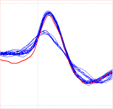
This is the trace that was previously highlighted (see figure above), and we thus know that it is triggered by event 17. - Click the trace.
Two things happen. First, the sweep becomes highlighted in the Scope view (and the value in the highlight edit box changes to 17). Second, in the main chart display event number 17 in channel a becomes centred in the window. Also note that the event is drawn higher than surrounding events, to indicate that it is centred as a result of a “go to” operation. You can see that the cause of the outlier low value of the early part of this trace in the sweep is due to summation with the negative phase of a preceding spike.
Sweep Colours
The Sweep Colours frame contains 3 options for setting the sweep colours:
- from Trace
Sweep traces have the same colour as their source data trace in the main view. This is the default selection, which is why all the sweeps in the Scope view are coloured blue. - from Sequence
Each sweep trace is drawn in a colour dependent on its place in the sequence of displayed traces. Early traces show in blue, gradually changing to red as the sequence progresses. The way colours are mapped onto the sequence can be observed and/or edited by clicking the Seq map button.
This may be useful if you suspect that waveforms show a systematic change over time. - from Events
Individual events can have their own colours, and Scope view sweeps can be coloured according to the colour of the event that triggers them.
- Select the from Events option.
All the events in channel a are black, so the sweeps turn black when you select this choice. - Set the Trig chan (top-left of the dialog) to b.
The events in channel b are coloured, and so the individual sweeps are now coloured. - Set the Count to -1 to display all the sweeps in channel b (there are 511), and observe that different-shaped spikes are drawn in different colours.
The events in channel b were coloured using the Dataview spike sorting described elsewhere. Note that the green sweeps are a "bucket class" for spikes that could not be assigned to any well-defined waveform shape. These are probably compound waveforms resulting from the simultaneous occurrence of spikes from different axons within the nerve bundle.
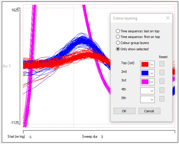
- Click the Layering button to open the Colour Layers dialog.
- Set the parameters in the dialog as shown in the image belowThis dialog was recalled after having been set previously. Changes made in the Colour layers dialog do not take effect until you close it., and Close the dialog.
The Scope view now only shows sweeps in the selected colours, and that these are layered in the order you specified in the dialog box.
Raster Display
- Shut down the Scope view and re-open it as a quick way to return to the default settings.
- Click the 2D raster button at the bottom left of the Scope view to see the 2D Intensity raster dialog.
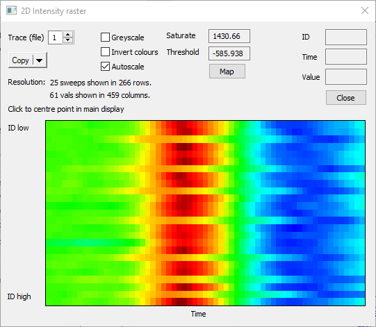
This shows each sweep of the Scope view as a separate row, with the successive values in the sweep displayed in left-to-right columns, colour-coded according to amplitude. Thus the smaller spikes in the Scope view are represented by the yellowish horizontal bands interrupting the deeper red vertical stripe generated by the larger spikes.
You can navigate to the parent event in the main Chart display by clicking on the appropriate row in the intensity raster.
- Close the Raster dialog.
3D
- Set the Count to 100 in the Sweeps to Draw frame.
- Select the from Sequence option in the Sweep Colours frame.
- Click the 3D button at the bottom left of the Scope view to see the 3D Scope View dialog.
The 3D display can be rotated by dragging with the mouse, or it can be set to autorotate. You can make a video of the rotation if you wish (uncompressed avi format).
Density (‘Heat’) plot
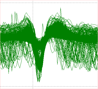
A simple display of overlaid sweeps can be misleading because each sweep is opaque, and so a relatively small number of sweeps evenly spaced across a region of the display can appear as a solid block. This can obscure the fact that some regions may be overdrawn by many sweeps, while others by only a few (but enough to cover the area).
The plot on the left below (which comes from a different file) shows such a situation. Underlying discontinuities in waveform profile can be revealed by a density (or ‘heat’) plot (below right). Here the display area is divided into XY bins, where the X bins are the sample intervals and the Y bins are voltage bins (each pixel row represents a separate bin). The intensity of the display within any bin reflects the number of sweeps which have a sample whose voltage and time of occurrence fall within that bin. In other words, the display is a 2D histogram, in which the bin counts are represented by colour. The density plot makes it obvious that there are at least 3 different voltage profiles within the solid colour block of the standard display following the negative peak.
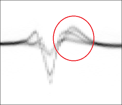
A density plot can reveal patterns obscured in the normal display. a. Many sweeps are superimposed, and although there are definitely different spike sizes in the display it is not clear what the size distribution is. b. A heat plot of the same data shows that there are at least 3 different size classes (red circle, added with external editor).
Phase plane
Phase plane plots are normally used to explore the dynamical properties of pairs of coupled differential equations, but they can also be valuable in giving an alternative view of the shape of the system response, which can emphasise features that are not immediately obvious in a normal time-series plot.
- Click the dY/dt v Y button to open the Phase-plane analysis dialog.
The dialog shows a plot of the rate of change of the Y variable (calculated as the simple adjacent difference) against the value of the Y variable, for each sample in each sweep. The two classes of spikes are immediately obvious, as is the difference in the maximum amplitude, and rates of rise and fall. The minimum amplitude, however, is quite similar for the two classes.
Phase plane plots are more normally used for intracelular recordings, and this can be explored here.
Event-Triggered Averaging
A common requirement is to average data in response to some trigger signal. So long as the trigger signal can be used to define an event, then data averaging is very simple.
- If necessary, reload the file r3s events.
- Shut down the Scope view and re-open it as a quick way to return to the default settings.
- Set the Count to -1 to show all the 326 sweeps triggered by events in channel a.
- Check the Average box towards the bottom-left of the dialog.
The multiple sweeps on the screen are replaced by a single sweep which is the sample-by-sample average of the previously-displayed sweeps.
If you wish you can save the averaged waveform as an independent file by clicking the Save avg button (which is only enabled in the Average draw mode).
Note that only displayed sweeps contribute to the average, so you can eliminate specific sweeps if you so choose. - Check the raw box to display the raw events that contributed to the average by checking the raw box.
The raw events display in the colour selected by the adjacent Col button.
You can use the Highlight sweep option to identify individual sweeps of raw data and compare them to the average. - Check the s.d. box to display the uncertainty envelope as a user-selected multiple of the standard deviation (set in the s.d. mult edit box) of each point.
The envelope colour can be selected with the adjacent Col button.
The Scope view could now look like this:
Partitioning averages by colour
The average in the image above is clearly constructed from two underlying waveforms. We can draw separate averages if the trigger events have been coloured using a spike sorting routine.
- Uncheck the average box (many display options are disabled while average is selected)
- Set the Trig channel to b, the Count to -1, and Sweep colours to from Events.
- Re-check Avg, and observe that separate averages are drawn for each colour.
You can display just a subset of these averages using the Layering option, but the choice has to be made with average not selected (obviously you can switch back-and-forth between the average and non-average view, so this is not a big restriction).
Improve Signal-to-Noise
Event-triggered averaging is particularly useful if the response is small compared to the noise level, in which case the response to a single stimulus may not be visible.
- Load file noise avg.
This show a trace containing white noise, except that a small offset has been added to the data within each event. The offset is completely invisible in the standard chart display.
- Close and re-open the Scope view to return its parameters to default conditions.
- Set the Start time to -5 ms and the Sweep duration to 25 ms.
It is still impossible to see any offset within the data traces. - Check the Avg box.
There is just the hint of an elevated response in the trace to the left of centre, but with only 25 sweeps being averaged, it is not at all clear whether this is significant. - Set the count to -1 to include all the sweeps in the averages.
The offset within the data phase-locked to each event is now fairly obvious. However, it is still not absolutely certain that it differs significantly from the surrounding non-offset waveform.
Plus-Minus Noise Reference Average
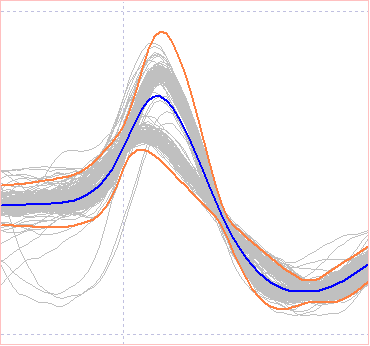
- With the Scope view displaying data from the previous section, check the +/-avg box.
This displays a green line which is also the average of the sweeps, except that all the odd-numbered sweeps have been inverted before adding them to the accumulating average (and the averaging count has been rounded down to 396, so there is an equal number of odd- and even-numbered sweeps). This has no effect on the distribution of noise (variances are additive whether you add or subtract data value), but any signal within the data should disappear, because the odd and even sweeps will cancel each other out. So the green line represents the residual noise in the absence of any signal. Comparison of the noise to the noise + signal plot helps us decide whether deviations in the average signal are significant. In this case I think there is no doubt that the signal is genuine. (I have even less doubt, because I constructed the signal!)
- Check the raw and s.d. boxes to see the raw data and the 2 × standard deviation limits as well as the other information.
If there is a DC component to the signal, then the signal average will reflect this but it will disappear in the +/- average, which will be centred at 0. This can make comparison difficult. The nearby align check box forces +/- average to have the same starting value as the signal average, thus aiding comparison.
It is worth remembering that averaging reduces the noise in a signal in proportion to the square root of the count in the average. So averaging 16 sweeps increases the signal-to-noise ratio by a factor of 4. But the square root means there is a law of diminishing returns – to increase the ratio by 8 we need to average 64 sweeps.
Trace Correlation
One common use of the Scope view is to look for time-synchronized (correlated) activity in different traces within a recording.
- Load file cpr intra extra.
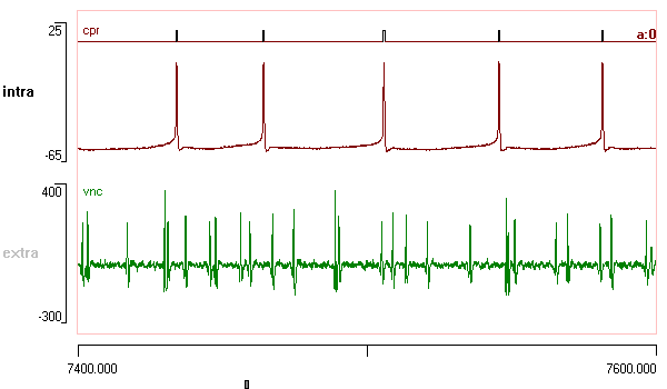
The file shows an intracellular recording from a caudal photoreceptor (CPR) in the last abdominal ganglion of crayfish and a simultaneous extracellular recording from the ventral nerve cord made about 10 mm rostrally. The intracellular CPR spikes have been marked by events in channel a using a simple threshold-crossing algorithm.
- Activate the Scope view.
- Set the Count to -1 to show sweeps for all 131 events
- Increase the Sweep duration to 6.

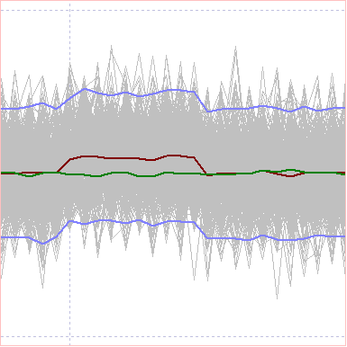
There is 1:1 correlation between intracellular and extracellular spikes and minimal jitter in the latency, so the evidence suggests that the CPR axon projects at least 10 mm rostrally, and that its conduction velocity is about 0.3 m s-1.
- Check the Avg box to see "purified" (de-noised) versions of the intracellular and extracellular spikes.
- Uncheck the box before you move on to the next section.
Measuring Data from the Scope view
A wide variety of measurements can be made by suitably tuning events and then using the Event analyse: List/save parameters option. However, you can also make simple measurements from the Scope view itself.
- Click Measure to activate the modeless Measure dialog box.
Drag the new dialog so that it is clear of the Scope view. - There is a frame labelled Values at nearest node to mouse at the top left of the dialog.
- Move the mouse across the Scope view display and observe that the numerical values shown in this group change to reflect the mouse position.
The programme searches for the nearest data node to the mouse location (a data node is a data sample of a particular value at a particular time; nearest is defined as Euclidean distance). A small vertical cursor is drawn across the sweep to indicate which sweep node is detected. It displays the time of the node, both relative to the Scope display and relative to the file start. It also displays the trace and trigger event from which the node derives, and the voltage value of that node.
- Hover the mouse over the peak of the largest extracellular (green) spike. (This spike was chosen because it occurs in a single sweep and stands out from the other spikes.)
In the Measure dialog you should see that this is associated with trace 2, Event ID 130. You can also see numerical values associated with that data point. - Right-click the mouse while hovering in this location. (This will actually activate the Measure dialog box if it is not already displayed.)
The values displayed in the Measure dialog are copied to the output text display in the lower part of the dialog. Multiple measurements can be made by right-clicking at different locations. If desired, the output text can be copied to the clipboard by clicking the Copy button. - Check the Avg box in the main Scope View dialog box to display the average of the intracellular spike waveform and the corresponding extracellular spike.
- Right-click on the peak of the averaged extracellular spike to show the mean value and standard deviation measured from the 131 sweeps that contribute to the average.
You can also make measurements related to specific times within the Scope view.
- Make sure that the Avg box in the Scope view dialog is checked.
- Check the Raw box in the dialog.
You now see the raw data traces in grey, as well as the averages. - Check the two Time cursor boxes Show T1 and Show T2 near the bottom-left of the dialog.
A red and blue cursor show in the Scope view, drawn at times of 1 and 2 ms relative to the start of the display. - Drag the red cursor to the time of the peak of the intracellular spike in trace 1.
The T (rel disp) for T1 should show 1.2. - Drag the blue cursor to the peak of the extracellular spike in trace 2.
The T (rel disp) for T2 should now show 4.32.- Note that the time values show in both the Scope view and in the Measure dialog, and could be manually adjusted in either.
- Click the Measure button in the Measure dialog.
The results of the measurement show in the edit box in the lower part of the dialog. These include:- the time between the cursors ((T2 - T1), which gives a time value for calculating the conduction velocity (assuming the distance between electrodes is known)
- the mean peak amplitude of the intracellular spike, along with its s.d. (Trace 1, Mean (V1), S.D. (V1))
- and the mean post-spike membrane potential and its s.d. (Trace 1, Mean (V2), S.D. (V2)).
- Uncheck the Average box in the Scope dialog.
- Click Clear in the Measure dialog.
- Click Measure again in the Measure dialog.
You now see the same measurements as previously, plus individual measurements from each sweep.
If the time to average box in the Measure dialog is set to a value greater than 0, then rather than reporting data values at exactly the specified times, the values are measured as the average from the specified time for the duration shown in the time to average box. This is so that averaging can be used to reduce variation due to trace noise. (Note that s.d. values shown in the results reflect the variation between the traces, not within the average of each trace.)
High-Definition Output
- Click Scale bars to insert scale bars with similar options to those in the main view.
Note that if you want to edit a scale bar, you have to delete and re-insert it. - Click Save Hi-Def to write EPS or SVG files for preparing publication-quality figures.
See also...
Stimulus-response analysis: Evoked potentials