Joint Peri-Stimulus Time Histogram
It sometimes happens that one wants to look for connections between two neurons, but the two neurons have only a low level of spontaneous activity. In these cases it is common to stimulate the preparation to increase the general activity levels. However, this can produce an artefactual apparent correlation between the two neurons. If their separate firing rates are independently elevated by the stimulus then there will be an inevitable increase in the probability of them firing synchronously that has nothing to do with the presence of any excitatory connection between them, but which can appear as such in a standard cross-correlation analysis.
The effects of the stimulus and internal connectivity can be separated out and analysed using the joint peri-stimulus time (JPST) analysis facility. This closely follows the methodology proposed by Aertsen et al. (1989). Prof. Gerstein’s MU (multi-unit) laboratory provides an excellent website which describes the procedure in some detail, along with Matlab code to implement it. The data provided as an example for use with this Matlab code is available in DataView format in the file mu-lab and you can look at this to compare it with the Matlab results if you wish. But for now use the following procedure.
- Load the file jpsth.
Note that in this file the data waveforms are only shown for the first part of the file, the remainder is event-only to reduce the disk space occupied.

These data are simulated using Neurosim from a known circuit.
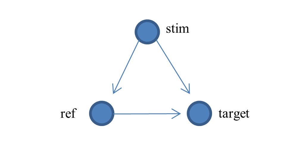
A stimulating neuron (trace 1) puts a long duration EPSP onto a reference (trace 2) and target (trace 3) neuron, which causes an increase in spike frequency in both post-synaptic neurons. The reference neuron also makes a brief and quite weak excitatory synapse onto the target neuron. The effect of this is not obvious from the raw data, but will become apparent in the analysis.
- Activate the Event analyse: JPSTH menu command to activate the JPSTH dialog.
- Set the Bin width to 10 ms.
- Click the Analyse button.
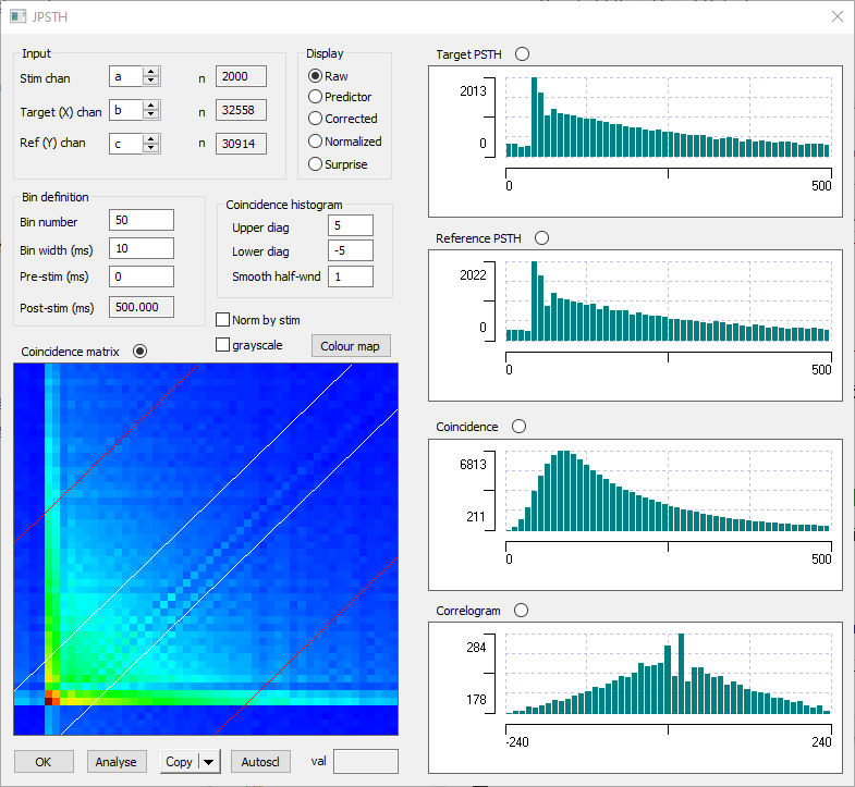
Coincidence matrix
The coloured coincidence matrix at the bottom left is a key part of the analysis. With the parameters set as in the image above, the matrix is 50 x 50 bins, with each bin 10 ms wide. The colours represent the intensity of coincident spiking at the set times relative to the stimulus (click the Colour map button to see the relative coding), with the zero time at the bottom left of the matrix.
To make this concrete, the time of occurrence and matrix bin number of the first 3 spikes in the reference and target neurons, relative to the first stimulus, is shown below:
Reference |
Target |
||
Time |
Bin (time/10) |
Time |
Bin (time/10) |
3 |
0 |
32.5 |
3 |
33 |
3 |
44 |
4 |
43 |
4 |
60.5 |
6 |
With these spike times, the counts in the matrix cells shown below are incremented (remember, 0,0 is bottom left). Thus the first reference spike occurs in bin column 0 and the target spikes thus cause increments in rows 3, 4 and 6 of column 0. The second reference spike occurs in bin column 3, and the same target spikes cause increments in target rows 3, 4 and 6 of column 3. Etc.
6 |
0,6 |
|
|
3,6 |
4,6 |
|
|
5 |
|
|
|
|
|
|
|
4 |
0,4 |
|
|
3,4 |
4,4 |
|
|
3 |
0,3 |
|
|
3,3 |
4,3 |
|
|
2 |
|
|
|
|
|
|
|
1 |
|
|
|
|
|
|
|
0 |
|
|
|
|
|
|
|
|
0 |
1 |
2 |
3 |
4 |
5 |
6 |
This is repeated for each stimulus. If the Norm by stim box was checked, the total counts would be divided by the stimulus number, but it isn’t so they aren’t.
- Hover the mouse over the dark red cell near the bottom-left (4,4) of the matrix. The total count (2038) is shown in the Val box.
This is the largest value in the matrix, and results from the sudden increase in spike frequency in both neurons resulting from the onset of synaptic input from the stimulus neuron. This simulated input was programmed with a 40 ms synaptic delay.
Histograms
PSTH
The top two histograms are straightforward peri-stimulus time histograms for the target and reference neurons. They both show a step increase in spike counts in the 5th bin due to the onset of the stimulus EPSP. Interestingly, there is a brief decrease in firing probability immediately following the step increase, presumably due to the synchronized refractory period. There is then a gradual decrease as the influence of the stimulus wanes.
Coincidence
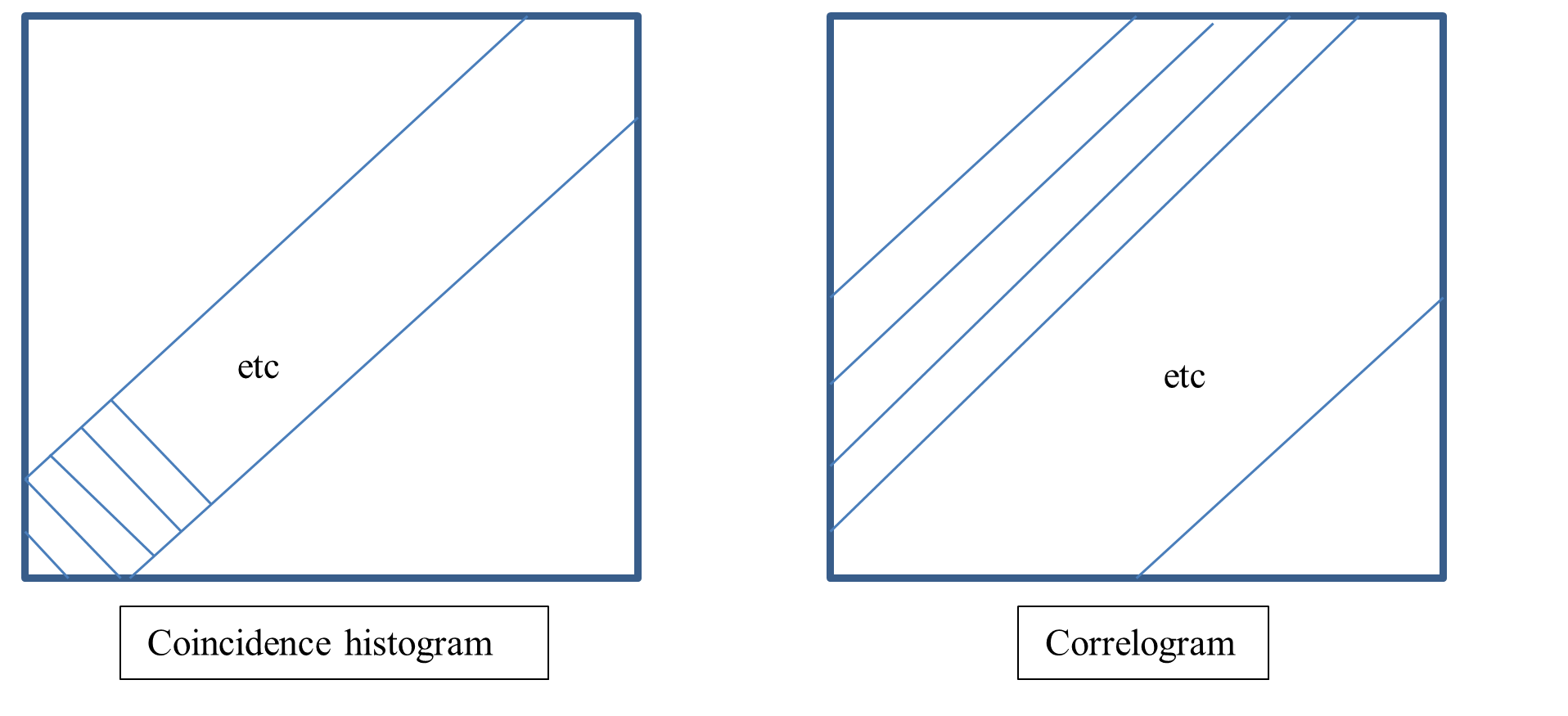
The coincidence histogram is derived from the diagonal bins of the coincidence matrix. The main diagonal (bottom left to top right) represents absolute coincidence (within the limits of the bin width) between target and reference neurons. Thus in its simplest form the coincidence histogram is simply a plot of the counts in the main diagonal of the matrix. However, you can choose to include off-main diagonals by setting the Upper and/or Lower diag to non-zero bin values. The white diagonal lines drawn on the matrix show which diagonals are included in the histogram. Offset diagonals represent reference and target neuron spikes which are synchronized but with non-zero delay between them. There is no compensation for the different lengths of the diagonals contributing to the histogram if you include off-main diagonals.
You can smooth the coincidence histogram (4 iterations of a moving average) by setting the Smooth half-window greater than 0.
Correlogram
The correlogram histogram is the equivalent of a straightforward cross-correlation histogram between reference and target neurons. It is generated by bin-by-bin summing of the paradiagonals (i.e. top-left to bottom-right diagonals) within the red lines drawn on the matrix. The correlogram bins are appropriately scaled to compensate for the reduced contribution at the edges of the histogram. Because several paradiagonals contribute to the histogram it is generally not necessary to smooth it.
With these sample data the correlogram has a smooth “hill” shape, but with a couple of sharp peaks near the summit. The hill reflects the increased synchrony (cross-correlation) due to the effect of the stimulus. The peaks are effects produced by the synaptic connection from the reference to the target neuron.
The diagrams below show how the coincidence and correlogram histograms are constructed. In each case, each (small) column represents a single bin in the histogram, and data within the columns are summed.
Predictor: the Effects of the Stimulus Alone
The raw display shows the mixed effects of the stimulus and neuronal interactions: we want to separate them out. The traditional way to determine the effects of the stimulus independently from the interaction effect is through a “shift predictor”. This means that a cross-correlation histogram is constructed, but instead of using reference and target spike times within the same stimulus episode, a different stimulus episode is used for each. Usually the target episode is shifted by one stimulus relative to the reference episode, hence the name. This shifting removes any moment-by-moment influence that the reference neuron has on the target neuron, but maintains the influence of the stimulus on both neurons (which is assumed to be similar in each episode). An elaboration of this method is to compute the correlation as the average of all possible shifts, rather than just one.
- Click the Predictor radio button in the Display panel.
This computes the coincidence matrix as the outer cross-product of the individual PST histograms. This is mathematically equivalent to calculating the matrix across all possible shift combinations (including no shift). You can see that the diagonal stripes have disappeared from the coincidence matrix, because we have eliminated the effect of the direct interaction between the reference and target neurons. However, the coincidence histogram still shows a strong influence due to the stimulus, and the correlogram histogram shows the smooth hill shape. This set of data thus constidutes the “null hypothesis” of what we would expect from the stimulus alone, if there were no inter-neuron interaction.
Corrected: the Effects of the Neural Interaction Alone
- Click the Corrected radio button.
The displays now show the raw data minus the predicted data. The effect of the stimulus has been eliminated, and what we now see is the effect of the small EPSP that the reference neuron generates on the target neuron. This produces an excess of near-coincident firing, apparent as the diagonal stripe in the coincidence matrix (which is now equivalent to a cross-covariance matrix). There are also periods of reduced firing near the diagonal due to the synchronized refractory periods. However, the horizontal stripes, due to the influence of the stimulus, have disappeared. The correlogram histogram has now lost the underlying hill shape, but instead has a sharp positive peak with about +20 ms latency. This reflects the synaptic delay of the reference-target interaction, which was programmed as 20 ms.
Normalized
Aertsen et al. suggest that the most appropriate normalization is to divide the corrected (cross covariance) matrix by the standard deviation of the predictor matrix. The latter is calculated as the outer-product of the standard deviations of each bin of the PST histograms.
- Select Normalized in the Display panel to see the result.
Surprise
We would like an indication of the statistical significance of departures of the corrected matrix from the predictor matrix. The raw matrix is essentially a measure of counts, and as such is likely to follow a Poisson distribution. The predictor matrix can be regarded as the null hypothesis, where each count is the Poisson mean value. It is then easy to calculate the statistical p-value of the actual (raw) counts in terms of the probability of achieving fewer than the actual counts. Then the probability of achieving equal or more counts is 1-p.
A straight plot of probability is not very informative, because we are only interested in the extremes of the p-values. Aertsen et al. suggest using a plot of the negative log of probability, which stretches out the extremes. It also relates the probability to the “surprise” value of the information content. The excitation surprise is –log(1-p), where p will be a value close to 1 for significant excitation, while inhibition surprise is –log(p), where p will be a value close to 0 for significant inhibition. If we plot excitation surprise – inhibition surprise then for significant deviations from the null hypothesis, one or other of these values will be large, while the other will be small. So the plot equals either excitation surprise, or the negative of inhibition surprise. So large positive values mean significant excitation, while large negative values mean significant inhibition.
- Select Surprise from the Display panel to see the result.
See Also ...