
5 Reports and Charts
The MMS Exams tool provides the following repords and charts:
- Data entry over time
- Mark / Grade scatter plot
- Frequency of exam grade by classification
5.1 Data entry over time
In addition to the Exam overview which displays the current exam marks and grades, there is a Historical reports section which allows you to view exam marks as they looked in the past. These point-in-time reports are generated when marks are saved. To view the point-in-time reports:
- Access the Exam tool from the MMS Modules page or from the Academic activities workspace in MySaint (see Exams - Creating and access the Exam tool).
- Scroll down to the Historical reports section.
- Select the report from the drop down list.
- Select the Show historic data button.
- The mark table will then change to display the data as it was at the point of time selected.
5.2 Mark / Grade scatter plot
The Mark / Grade scatter plot displays the marks the students received for their exams, and how these translate to grades. The plot also contains a line giving a visual representation of the mark / grade map. An example of the Mark / Grade scatter plot is given in Figure 7.
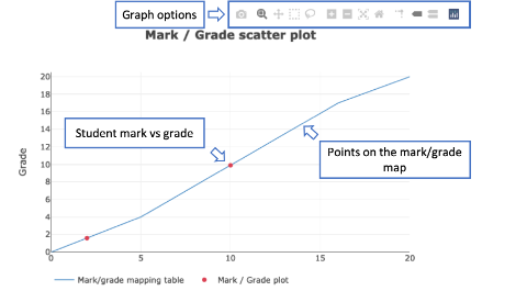
Figure 7: An exam Mark / Grade scatter plot. Student mark/grades are indicated with red points. Hover over the scatter plot to access the Graph options.
To view the Mark / Grade scatter plot:
- Access the Exam tool from the MMS Modules page or from the Academic activities workspace in MySaint (see Exams - Creating and access the Exam tool).
- Select the Graph option from the navigation panel in the left.
- The Mark / Grade scatter plot appears at the top of the page.
Student marks/grades are represented with red dots, hover over or select the point to view the mark, grade and student name. To access graph options, such as downloading the graph as an image and to ‘zoom in’ on selected areas, hover over the graph to access the graph options. These will appear at the top of the graph – see Figure 7.
5.3 Frequency of exam grade by classification
The Frequency of exam grade by classification bar chart displays the grades the students received for their exams by classification. An example of the frequency of exam grades by classification bar chart is given in Figure 8.
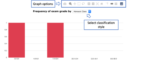
Figure 8: An example of the frequency of exam grades by classification bar chart. To change the classification style select a new style from the drop down list.
To view the Frequency of exam grade by classification bar chart:
- Access the Exam tool from the MMS Modules page or from the Academic activities workspace in MySaint (see Exams - Creating and access the Exam tool).
- Select the Graph option from the navigation panel in the left.
- The Frequency of exam grade by classification bar chart appears at the bottom of the page.
The student grades will be summed over the marking ranges defined by the selected classification style. To change the classification style select a new option form the drop down list above the bar chart. The options and their values are:
- Honours classification: 0.0 - 3.9, 4.0 – 6.9, 7.0 - 10.4, 10.5 - 13.4, 13.5 – 16.4, 16.5 – 20.0
- Masters classification: 0.0 – 6.9, 7.0 – 13.4, 13.5 – 16.4, 16.5 – 20.0
- Grade Points: 0.0 – 0.9, 1.0 – 1.9, 2.0 – 2.9 etc
To access graph options, such as downloading the graph as an image and to ‘zoom in’ on selected areas, hover over the graph to access the graph options. These will appear at the top of the graph – see Figure 8.
Previous: 4. Entering Exam marks