DataView has several general-purpose analysis facilities, including the following.
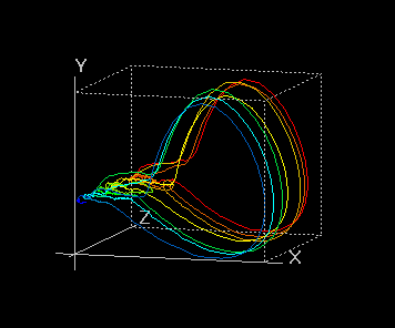
In phase-plane analysis, one time-dependent variable is plotted against another. A common use of phase-plane plots in neuroscience is to provide an alternate visualization of the shapes of features such as spikes or PSPs, which is achieved by plotting the membrane potential (V) against its time derivative (dV/dt) at each moment in time over the duration of the feature. The phase-plane plot can reveal subtle changes in shape over time that are difficult to pick up in an extended record.
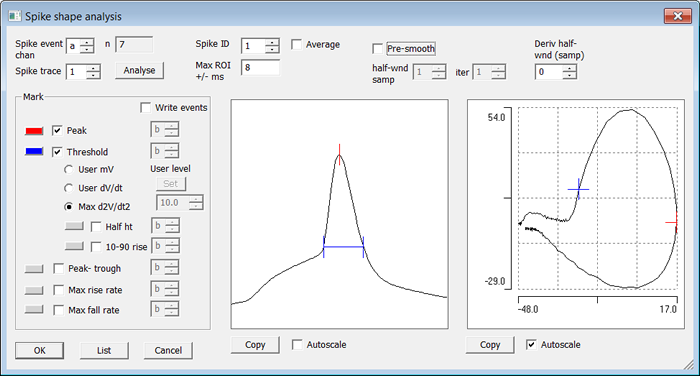
Spike threshold can be detected either as an absolute voltage threshold, or the voltage at which a user-specified rate of change of voltage occurs, or the voltage at which the rate of change of voltage changes most rapidly. From the threshold various metrics defining spike shape are calculated and can be displayed.
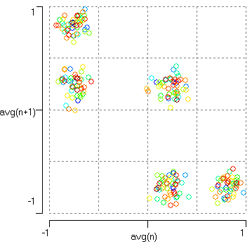
This technique simply involves plotting the value of an item in a sequence against the value of the next item in the sequence. Typically, each item could be the peak (or trough) value of successive cycles in an oscillating system. Plots of this sort can reveal “meta”-rhythms, i.e. rhythms within rhythms like the beat frequency of mixed oscillators, and is used in investigating biological phenomena such as heart beat and respiratory or locomotory rhythms.
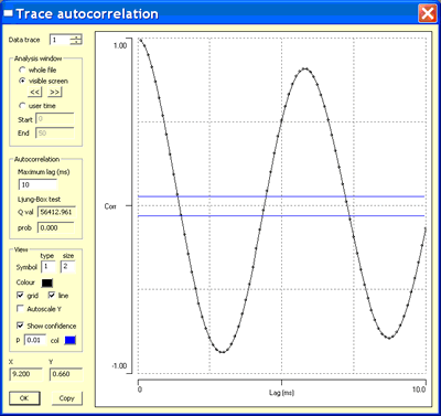
Auto- and cross-correlation analysis can be performed on both waveform and event data.
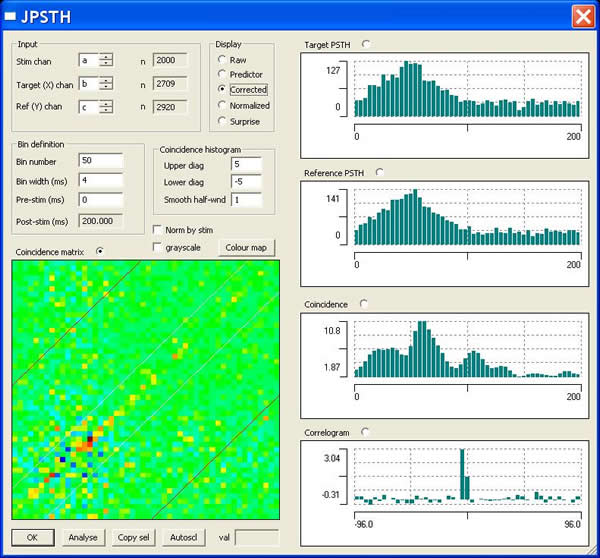
A JPSTH can be constructed as descibed by Aertsen et al. (1989, J. Neurophysiol. 61; 900-917), and the MU lab website.
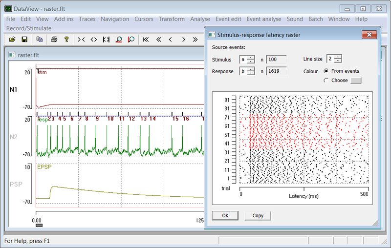
Raster plots can reveal the effects of a stimulus on spike frequency.
Any data file can be played as a sound. You can either play the data at the recording frequency,
or, if this is too low, you can select 5 or 11 kHz as the sound frequency.
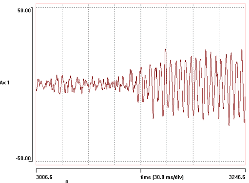
Listening to data played as sound can be a good way of detecting subtle changes in frequency or pattern within the data.
This facility utilises the DirectX sound capabiliy of PCs.